Pure Soul Brand at a Glance

 HOLISTIC LOGO DESIGN

Brand: Pure Soul

Location: New Zeeland

Field: Reiki & Holistic Healing

Services: Logo Design

Pure Soul is a holistic practice founded by a Reiki Master and intuitive guide who works with light, movement and connection to nature as tools for healing. 

The client approached Amritaé Design to create a logo able to represent the essence of synergy: the harmony between human presence, natural elements and divine consciousness.

The creative direction focused on designing a mark that would stand independently across various contexts (from wellness products to workshops), maintaining visual clarity while conveying spiritual depth. Amritaé’s role was to interpret a deeply personal story into a timeless, balanced and memorable visual form.

Explore this project on Behance. If you enjoyed it, tap the like button to appreciate the project and help it reach more creatives.

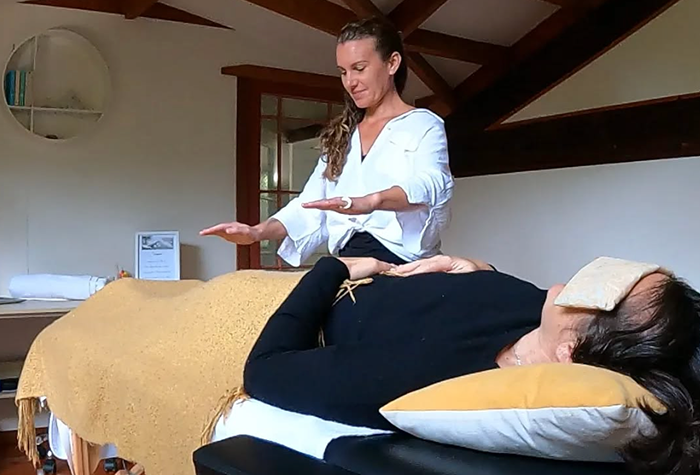
Essence: What Pure Soul Stands For

Pure Soul embodies the journey of wholeness: a return to self through light, truth and alignment. It is for those who walk the path of awareness and healing while staying grounded in real life. The brand reflects both calm and gentle authority, qualities that allow others to feel safe, seen and inspired in their own transformation.

Pure Soul stands for:

  • Integration of light and form — bridging the physical and the spiritual

  • Embodied healing through awareness, nature, and movement

  • The journey from individuality to universal connection

  • Emotional maturity and spiritual depth

  • Synergy between giving and receiving, inner and outer transformation

Design Direction: Refined, Grounded, Expansive

 On the energetic map, Pure Soul is:

Balanced | Fluid | Mature | Illuminated | Natural | Grounded

The design direction focused on translating spiritual authenticity into professional visual form.

There are no excessive mystical details — only intentional structure and movement.

The logo carries both emotional and visual balance: it is fluid yet structured, symbolic yet functional, energetic yet calm.

The aesthetic draws from light symbolism and organic motion. Every curve and line reflects continuity and natural flow, representing how spiritual evolution unfolds gradually and harmoniously, like the movement of tides or breath.

Symbol Concept – Spiral+Chakras+Hands

The Pure Soul logo is built on the idea of alignment and energy flow.

The composition integrates three key elements that define the client’s work and essence:

  1. The Spiral — representing radiating energy, transformation and the continuous movement of life force. It symbolises how healing expands outward from the centre, reflecting the natural rhythm of personal growth.

  2. The Vertical Alignment of Dots — representing the seven chakras, they express energetic harmony and the progressive awakening of awareness through the body.

  3. Supporting Hand Motif — symbolising care, channelled energy and presence in healing work.

Together, these elements form a coherent visual structure: energy that rises and circulates, guided by intention, balance and flow.

The design reflects the deeper work of healing and holding space for others.

The symbol expresses presence, alignment, and inner healing: two hands, a central source of energy and the intelligence of the body, the way we return to our inner truth through care, practice and connection.

Logo Arhitecture

The architecture of Pure Soul Logo Design combines vertical balance with organic flow, reflecting Reiki’s essence of structured yet intuitive energy.

Colour World – Light & Nature

The visual system for Pure Soul is based on light and natural balance.

The selected colours convey the brand’s essence: awareness through warmth, structure through flow and connection through presence. 

Colour Palette

Golden Dawn (#D0A52F): Represents illumination and vitality. It evokes warmth, energy and the life force that flows through the healing process.

Amber Earth (#BC912C): Brings depth and stability.

Sage Green (#677D5E): Suggests renewal, balance and connection to the natural world.

Together, the colour palette merges light and grounding, energy and calm, creating a refined visual harmony aligned with the purpose of Pure Soul.

Typography – Modern & Elegant

The typography system for Pure Soul is based on balance and refinement.

Each type choice contributes to a clean, modern aesthetic that supports the brand’s professional yet soulful tone.

Typography

Primary Font – Contralto Small Demi Bold (customised): Used for the main logo text. The adjusted “O” adds a distinctive character and a sense of continuity, making the wordmark both elegant and recognisable.

Secondary Font – Open Sans Regular: Applied for the tagline. Its geometric simplicity creates harmony with the refined logo mark.

Together, these fonts are aligning with Pure Soul’s essence of healing, connection and depth.

Client Experience

For some time I was trusting the right logo designer would align with me. Finding Yoli I just knew she was the Soul to support me on this Journey. Her process of creating and feeling into the logo is something special and unique. It really gives the design a holistic foundation and the energy is felt throughout the process and in the design itself. She really understood me on a concious level which helped the process beautifully. I'm soo proud & honored of my new logo, one I will cherish. Thank you Yoli for trusting the process alongside me as this gorgeous design birthed. Blessings
Laura
Pure Soul

How This Kind of Design Supports a Business

 A considered logo and visual identity change how a business shows up every day.

It’s not decoration. It’s structure.


What it gives the brand:

  • A recognizable face on: website, socials, documents, signage.

  • A coherent language of logo, color and type, so everything looks like it belongs to the same business.

  • Decision ease: no more guessing fonts, colours or styles for every new asset.

  • Higher perceived value: a brand that looks intentional supports better pricing and better clients.

  • Confidence for the founder: you know what your brand looks like, so you can focus on the work itself.

A proprietary process blending strategy, symbolism and essence mapping — shared in full with confirmed clients

How I build it

  • We start with the essence of the work: who you serve, what you stand for, and how you want people to feel.

  • I create a visual blueprint that maps symbols, mood, typography and color into a structured system.

  • From there, I design the logo and core identity elements and test them in real contexts: website, social, print.

  • You receive a compact, usable identity kit you can actually work with: logo files, color codes, type system and key applications.

This is bespoke work, built to hold the depth of what you do and to be usable in real life, day after day.

Your brand can feel this aligned

Ready for your own logo design/complete visual identity?

If this project resonates and you want your own logo and visual identity made with the same depth, let’s build it together.

Yoli, founder of Amritaé Design, working at her desk with a laptop and digital pen in a softly lit studio space.

Founder

Yoli Amritae

I’m Yoli, a brand identity designer and brand mentor focused on visual alignment.

I have 14+ years of design experience, plus studies and background in communication, PR and NGO management. That mix brings structure, strategy and precision into my work, alongside depth, creativity and originality.

In recent years, my work expanded beyond execution. I now combine design with 1:1 guidance that clarifies direction first, so your brand can reflect its true essence in a clear visual form.

“Yoli has a rare ability to truly understand your brand and translate it into visual language that feels both authentic and impactful.”
Shared by a valued, long-term client.

I work with conscious entrepreneurs, creatives, and founders who want their presence to feel true on the outside and aligned on the inside.

Get in touch if you want a brand that’s unmistakably yours.

Scroll to Top