Kashaya Tantra Brand at a Glance

 HOLISTIC LOGO DESIGN

Brand: Kashaya Tantra

Location: South Africa

Field: Tantra & Sacred Sexuality

Services: Logo Design

Kashaya Tantra offers trauma release sessions and retreats that combine Tantric and Taoist wisdom, bioenergetics and somatic healing.

Each session guides participants beyond the limits of narrative, allowing the body and soul to access their innate intelligence and transcend personal history.

The name Kashaya originates from Jain philosophy, where it signifies passion – the inner fire of emotion that moves the soul beyond worldly attachment.

The brand’s essence lies in transformation through embodiment, where awareness and energy become tools for healing, empowerment and liberation.

Explore this project on Behance. If you enjoyed it, tap the like button to appreciate the project and help it reach more creatives.

holistic logo design Kashaya Tantra

Essence: What Kashaya Tantra Stands For

A practice rooted in truth and presence, Kashaya Tantra represents the meeting point between sacred sexuality, embodied healing, and spiritual maturity.

It serves as a bridge between ancient esoteric knowledge and modern trauma recovery, offering a grounded path to personal freedom and wholeness.

Design Direction: Transformative, Passionate, Liberating

 On the energetic map, Kashaya Tantra is:

Grounded and transformative | Passionate and conscious | Deep and liberating | Sacred and embodied

The logo design takes inspiration from the Kali Yantra, the sacred geometry of transformation and liberation.

Its intersecting triangles express polarity in motion — the dance between creation and dissolution, matter and spirit.

The symbol mirrors both the inner alchemy of Tantra and the outer grace of sacred architecture: structured, fiery, and alive.

The typography is deliberately tantric, ornate, and sensuous, carrying both the weight and fluidity of the practice. It doesn’t aim for minimalism — it celebrates depth, movement, and energy.

Together with the logo, it forms a cohesive visual mantra: power meeting awareness

Symbol Concept – Kali Yantra

The symbol draws inspiration from the Kali Yantra, a sacred geometric form symbolising transformation, dissolution of illusion, and the liberation of energy.

Its intersecting triangles express the perpetual balance between creation and dissolution, the core rhythm of Tantric practice.

This integration forms the heart of the symbol: wholeness through polarity, the return to neutrality that Tantra teaches.


Logo Arhitecture

The Kashaya Tantra symbol follows the traditional geometry of the Kali Yantra, a balanced composition of triangles, circles and lotus petals arranged around a centred bindu, designed in an original way. 

Its layered symmetry reflects containment within expansion: a structure both protective and liberating.

Colour World – Deep, Sacred & Intense

The colour system of Kashaya Tantra embodies depth, transformation, and grounded sensuality: mirroring the Tantric path of integrating shadow and light.

Each tone was chosen to evoke the alchemy of embodiment: earth, blood, fire, and spirit.

Colour Palette

Wine (#3E1113) — Symbolises the mystery of passion and devotion; deep, embodied, and magnetic.

Deep Red (#681314) — Represents life force and sacred fire — intensity held with awareness.

Fire Red (#84201A) — The spark of transformation; movement, vitality, and creative ignition.

Charcoal Ash (#2C2B2A) — The grounding tone of stillness; presence after release.

Bronze (#98643E) — A note of wisdom and maturity; the radiance that follows transformation.

Together, these tones form a palette that feels both sacred and human — powerful, sensual and alive.

Typography – Sensuality & Confidence

The typography was chosen for its curvaceous, Tantric energy — rich, fluid, and confident. The chosen typography,  Dragonfly font, doesn’t seek simplicity but a strong presence: a font that feels alive, sensual and full-bodied.

Together, the elements create a visual identity that feels sacred yet embodied, both devotional and powerful.

Custom Illustration - Ardhanarishvara

I have created as a separate service for the client a custom vectorised illustration of Ardhanarishvara, to honour the Tantric philosophy of unity between the masculine and feminine aspects of consciousness.

It is not part of the logo itself but acts as a visual extension of the brand’s essence: a reminder that healing and transformation arise from the dance between these inner forces.

The illustration anchors the brand in sacred art, reverence and embodiment.

Client Experience

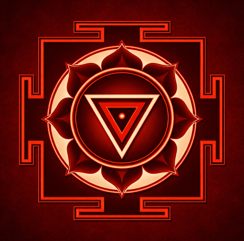
Working with Yoli was a deep process. Allowing her to create all of my design content was not just a technical process. We embarked on a journey which involved deep immersion into what the symbols and spiritual cultural interpretations symbolised. She holds deep wisdom from her own spiritual path which is very much reflected in her creativity and design work. She was very in tune with my requests for creating content that aligned with the strong spiritual component of my brand. My logo design reflect creative spiritual uniqueness through the symbols that she conceptualised and it's not easy to find someone who has this understanding and awareness
Marcelle Stein
Sexologist & Sexual Healing Specialist

How This Kind of Design Supports a Business

 A considered logo and visual identity change how a business shows up every day.

It’s not decoration. It’s structure.


What it gives the brand:

  • A recognizable face on: website, socials, documents, signage.

  • A coherent language of logo, color and type, so everything looks like it belongs to the same business.

  • Decision ease: no more guessing fonts, colours or styles for every new asset.

  • Higher perceived value: a brand that looks intentional supports better pricing and better clients.

  • Confidence for the founder: you know what your brand looks like, so you can focus on the work itself.

A proprietary process blending strategy, symbolism and essence mapping — shared in full with confirmed clients

How I build it

  • We start with the essence of the work: who you serve, what you stand for, and how you want people to feel.

  • I create a visual blueprint that maps symbols, mood, typography and color into a structured system.

  • From there, I design the logo and core identity elements and test them in real contexts: website, social, print.

  • You receive a compact, usable identity kit you can actually work with: logo files, color codes, type system and key applications.

This is bespoke work, built to hold the depth of what you do and to be usable in real life, day after day.

Your brand can feel this aligned

Ready for your own logo design/complete visual identity?

If this project resonates and you want your own logo and visual identity made with the same depth, let’s build it together.

Yoli, founder of Amritaé Design, working at her desk with a laptop and digital pen in a softly lit studio space.

Founder

Yoli Amritae

I’m Yoli, a brand identity designer and brand mentor focused on visual alignment.

I have 14+ years of design experience, plus studies and background in communication, PR and NGO management. That mix brings structure, strategy and precision into my work, alongside depth, creativity and originality.

In recent years, my work expanded beyond execution. I now combine design with 1:1 guidance that clarifies direction first, so your brand can reflect its true essence in a clear visual form.

“Yoli has a rare ability to truly understand your brand and translate it into visual language that feels both authentic and impactful.”
Shared by a valued, long-term client.

I work with conscious entrepreneurs, creatives, and founders who want their presence to feel true on the outside and aligned on the inside.

Get in touch if you want a brand that’s unmistakably yours.

Scroll to Top