Dharma Digital Brand at a Glance

 HOLISTIC LOGO DESIGN

Brand: Dharma Digital

Location: USA

Field: Conscious Marketing, Digital Strategy

Services: Logo Design

Tone: Purposeful, grounded, spiritual

Core Idea: Translating Dharma into digital form, aligning marketing with mindful communication and ethical action.

Dharma Digital is a conscious marketing studio that helps purpose-driven businesses communicate with awareness.

It blends modern strategy with spiritual intelligence, aligning words, visuals and actions with the deeper truth of the brand.

The name Dharma evokes the principle of right action and rightful purpose. This is what the brand stands for: bringing awareness into the digital space, where marketing becomes a mindful act of contribution and service.

Dharma Digital logo design by Amritaé Design, featuring a lotus and dharma wheel symbol over a laptop background, representing mindful and purpose-driven marketing.

Essence: What Dharma Digital Stands For

Dharma Digital brings together consciousness and communication.

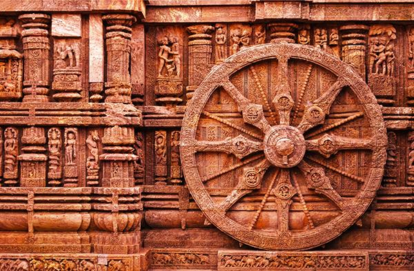
Inspired by Vedic symbology and the teachings of Krishna, Dharma Digital is built on the idea that right action (dharma) can guide even the modern language of technology. It represents communication as a devotional act.

It represents a new generation of digital studios, one that values transparency, truth and transformation as much as being goal oriented.

Its mission is to remind entrepreneurs that every message has energetic impact and that conscious visibility begins with awareness.

Through ethical marketing  Dharma Digital helps its clients express their essence clearly while staying true to their values.

Design Direction: Refined, Conscious, Devotional

On the energetic map, Dharma Digital is:

Awakened and clear | Devotional and intelligent | Balanced and radiant | Precise yet fluid

The design direction draws inspiration from sacred geometry, bringing together the digital order with devotional art.

Far from being merely a logo for a marketing agency, it is a visual yantra for conscious creation — where purpose, ethics, and beauty converge into one field of intelligent presence.

Symbol Concept – Lotus + Dharamchakra + Peacock

The Dharma Digital symbol unites three sacred archetypes into one harmonious form of clarity and devotion:

  • The Lotus — representing purity, growth and awakening through conscious effort.

  • The Dharmachakra — the Wheel of Dharma, symbol of right action and the awakened path.

  • The Peacock — Krishna’s vehicle of divine expression, representing beauty, communication and transcendence over pride.

The wheel emerges from the heart of the lotus, turning within layers of symmetry that mirror the rhythm of awareness in motion.

The presence of the peacock subtly expands the symbol’s meaning. Its feathers unfold like radiance, suggesting that when communication is rooted in dharma, beauty becomes service.

Together, these forms create a mandala of integrity and luminosity, a visual prayer for conscious creation, where marketing becomes a vehicle of awareness.

Logo Arhitecture

The Logo architecture is a balanced composition that merges organic expansion with digital structure to express alignment, rhythm and purpose.

Colour World – Earthy & Grounding

The colour palette is inspired from the colours traditionally associated with Lord Krishna — vibrant greens, teal and luminous gold that embodies divinity expressed through beauty and play.

These tones are also from the iridescent spectrum of the peacock, Krishna’s emblem of grace and transcendence over pride.

Colour Palette

Sea Green (#47967A) — Represents renewal and mindful growth; the harmony between nature and technology.

Teal (#3B847C) — Conveys emotional balance, trust and thoughtful connection — the essence of conscious communication.

Bronze (#B68236) — Symbolizes ethical action and prosperity achieved through purpose, not persuasion.

Together, the palette merges organic calm with professional depth — mirroring a brand that leads through integrity and awareness.

Typography – Strenght & Flow

The logo uses Roboto Black for the name font. It is a modern, geometric typeface that brings a grounding balance and structure. It is a clean font that reflects the brand’s digital nature, while its rounded edges keep the tone warm and human.

A subtle custom design detail connects typography with symbolism: the central dots of the “i” letters align with the center of the Dharmachakra, visually echoing the centered motion of the logo itself.

The tagline font, is a simple sans serif that provides contrast to the strength of the title.

It supports the composition by adding readability and flow, grounding the visual presence without competing with the primary mark.

Client Experience

Working with Yoli has been an amazing experience from start to finish. She really takes her time to understand what you are looking for, and can even help you realise what you never knew that you needed. She has a way of pulling the logo out of your soul, without you even realising it! I knew she was good, but I was still so blown away with the immense quality of her work. You will absolutely not regret using her services. Don't think twice, contact her now!
Isabella
Dharma Digital

How This Kind of Design Supports a Business

 A considered logo and visual identity change how a business shows up every day.

It’s not decoration. It’s structure.


What it gives the brand:

  • A recognizable face on: website, socials, documents, signage.

  • A coherent language of logo, color and type, so everything looks like it belongs to the same business.

  • Decision ease: no more guessing fonts, colours or styles for every new asset.

  • Higher perceived value: a brand that looks intentional supports better pricing and better clients.

  • Confidence for the founder: you know what your brand looks like, so you can focus on the work itself.

A proprietary process blending strategy, symbolism and essence mapping — shared in full with confirmed clients

How I build it

  • We start with the essence of the work: who you serve, what you stand for, and how you want people to feel.

  • I create a visual blueprint that maps symbols, mood, typography and color into a structured system.

  • From there, I design the logo and core identity elements and test them in real contexts: website, social, print.

  • You receive a compact, usable identity kit you can actually work with: logo files, color codes, type system and key applications.

This is bespoke work, built to hold the depth of what you do and to be usable in real life, day after day.

Your brand can feel this aligned

Ready for your own logo design/complete visual identity?

If this project resonates and you want your own logo and visual identity made with the same depth, let’s build it together.

Yoli, founder of Amritaé Design, working at her desk with a laptop and digital pen in a softly lit studio space.

Founder

Yoli Amritae

I’m Yoli, a brand identity designer and brand mentor focused on visual alignment.

I have 14+ years of design experience, plus studies and background in communication, PR and NGO management. That mix brings structure, strategy and precision into my work, alongside depth, creativity and originality.

In recent years, my work expanded beyond execution. I now combine design with 1:1 guidance that clarifies direction first, so your brand can reflect its true essence in a clear visual form.

“Yoli has a rare ability to truly understand your brand and translate it into visual language that feels both authentic and impactful.”
Shared by a valued, long-term client.

I work with conscious entrepreneurs, creatives, and founders who want their presence to feel true on the outside and aligned on the inside.

Get in touch if you want a brand that’s unmistakably yours.

Scroll to Top