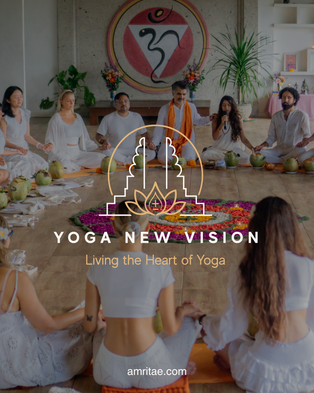
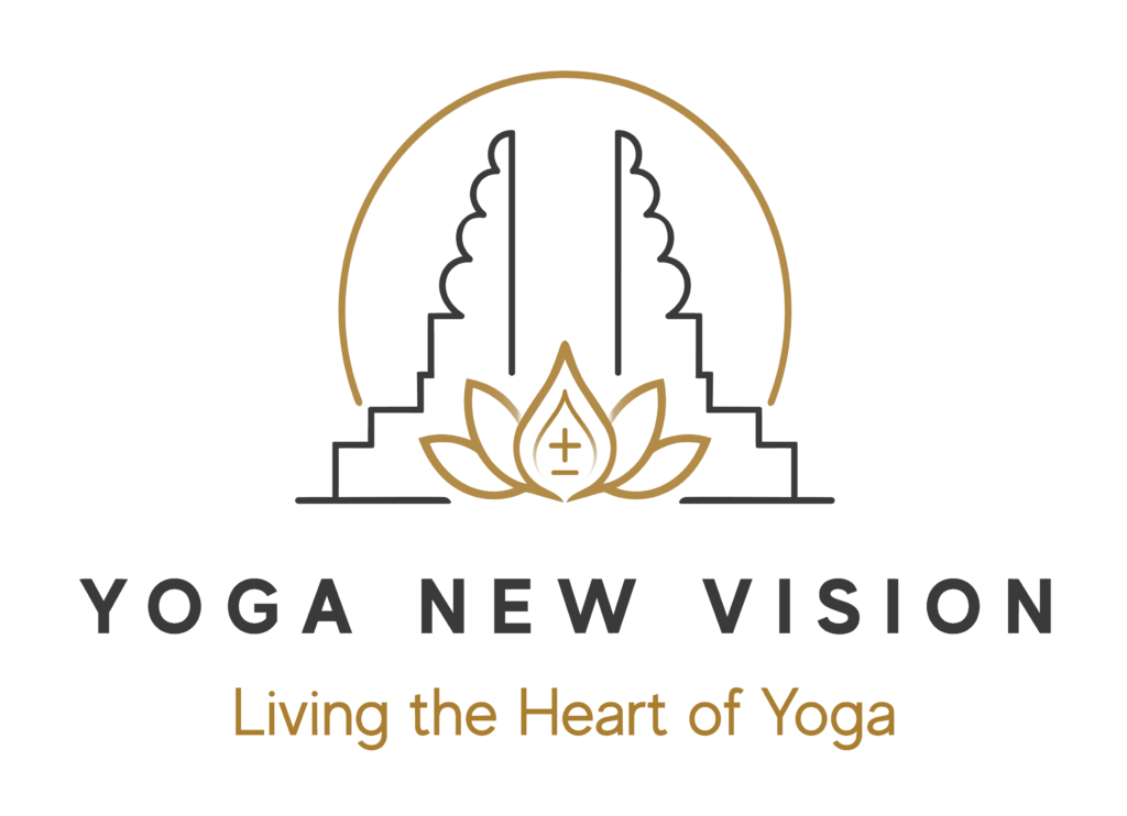
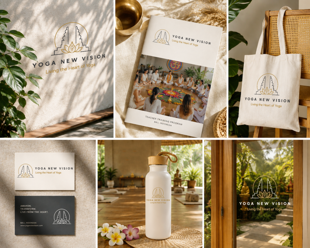

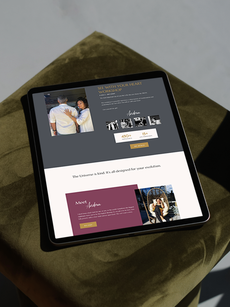
The holistic logo design for Yoga New Vision is inspired by Balinese culture, sacred symbolism and the transformative journey of yoga. It reflects the brand’s essence: inner awakening, balance, embodied wisdom and joyful living.
Brand: Yoga New Vision
Location: Bali, Indonesia
Field: Yoga Teacher Training & Holistic Education
Services: Logo Design
Focus: Sacred Symbolism • Yogic Philosophy • Modern Identity
Yoga New Vision is a yoga school in Bali offering immersive teacher trainings and programs that bring together traditional yogic teachings, embodied practice and conscious community. The school guides students through a deeper exploration of yoga as a way of living, encouraging greater self-awareness, balance and connection with the heart.
My role was to translate this philosophy into a logo design that feels both modern and deeply symbolic. Inspired by Balinese temple architecture, the lotus, the rising sun and the concept of polarity, the logo brings together the school’s core ideas in a clean and memorable mark, expressing transformation, harmony and a new vision of living.
Appreciate the case study on Behance.
Yoga New Vision is built on the understanding that what we seek outside already exists within.
Through self-remembrance, sacred teachings and embodied practice, the school guides students beyond personality and conditioning toward a deeper experience of presence, love and inner freedom.
Ancient wisdom is shared in a way that feels relevant for modern life, making timeless teachings accessible, practical and deeply transformative.
On the energetic map, Yoga New Vision is:
Every visual decision was inspired by Yoga New Vision’s intention to make authentic yogic wisdom accessible in a modern world.
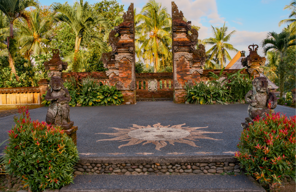
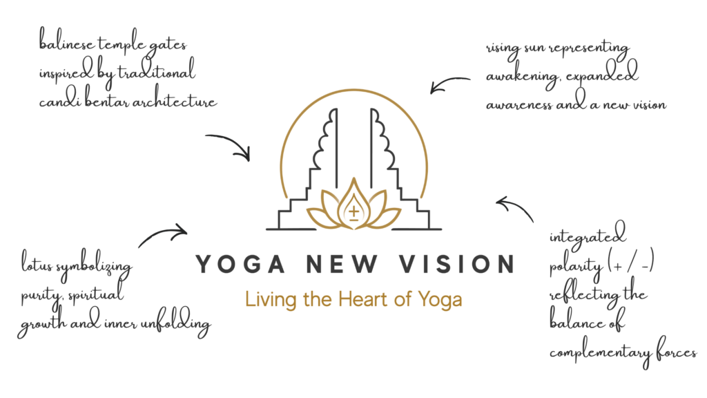
Inspired by Balinese architecture, the lotus and the balance of complementary forces of plus and minus signs, the logo design combines sacred symbolism with clean, contemporary forms.
The result is a design that is welcoming, grounded and enduring while communicating awakening, harmony and the living heart of yoga.
Balinese Temple Gates
Represent the threshold between the outer world and inner awareness. They also resemble the shape of praying hands.
Rising Sun
A symbol of awakening, clarity and a renewed perspective.
Lotus
Expresses spiritual growth, purity and transformation through practice.
Polarity (+ / −)
Integrated into the lotus, the polarity symbol reflects the union of masculine and feminine energies, balance and wholeness—a central theme within the school’s philosophy.
Symmetrical composition expressing harmony, stability and presence, with minimal geometric construction.
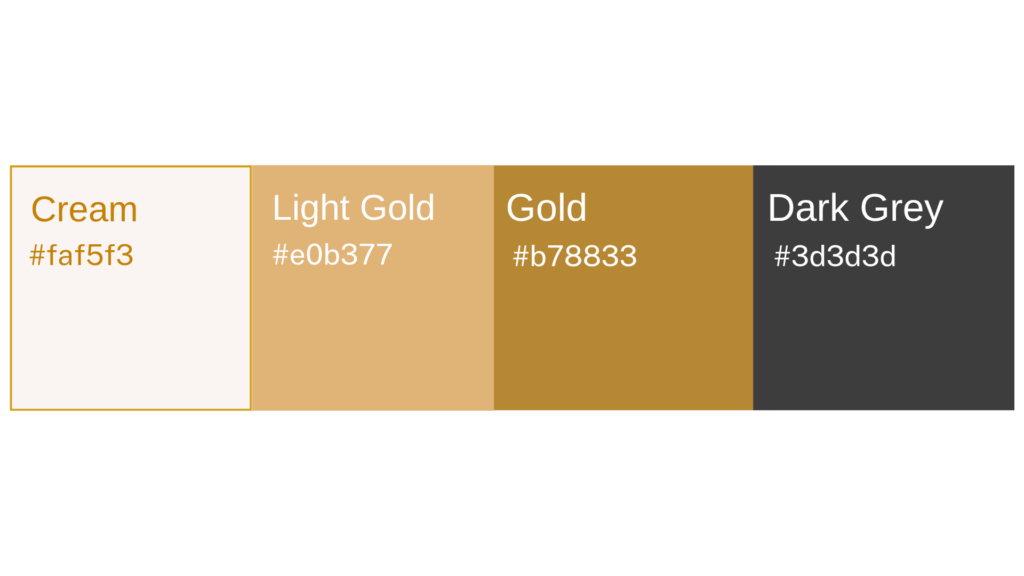
Temple Gold
A warm gold that brings a sense of value, wisdom and sacred tradition.
Charcoal Grey
Grounded, timeless and balanced, providing depth and stability.
Soft Cream
A light neutral that creates space, calm and visual balance.
The wordmark uses Evolve Sans Bold in all caps, with generous letter spacing to create a sense of opennessand balance. This wide tracking gives the identity a contemporary, premium feel while allowing the name to breathe.
For the tagline, Evolve Sans Regular in lowercase, creating a softer contrast that complements the strength of the primary wordmark.
Together, the two weights establish a clear visual hierarchy while maintaining a clean, timeless and highly legible identity.
A considered holistic logo design and visual identity change how a business shows up every day.
What it gives the brand:
A recognizable face on: website, socials, documents, signage.
A coherent language of logo, color and type, so everything looks like it belongs to the same business.
Decision ease: no more guessing fonts, colours or styles for every new asset.
Higher perceived value: a brand that looks intentional supports better pricing and better clients.
Confidence for the founder: you know what your brand looks like, so you can focus on the work itself.
A proprietary process blending strategy, symbolism and essence mapping — shared in full with confirmed clients
We start with the essence of the work: who you serve, what you stand for, and how you want people to feel.
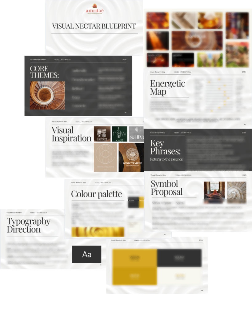
I create a visual blueprint that maps symbols, mood, typography and color into a structured system.
From there, I design the logo and core identity elements and test them in real contexts: website, social, print.
You receive a compact, usable identity kit you can actually work with: logo files, color codes, type system and key applications.
This is bespoke work, built to hold the depth of what you do and to be usable in real life, day after day.
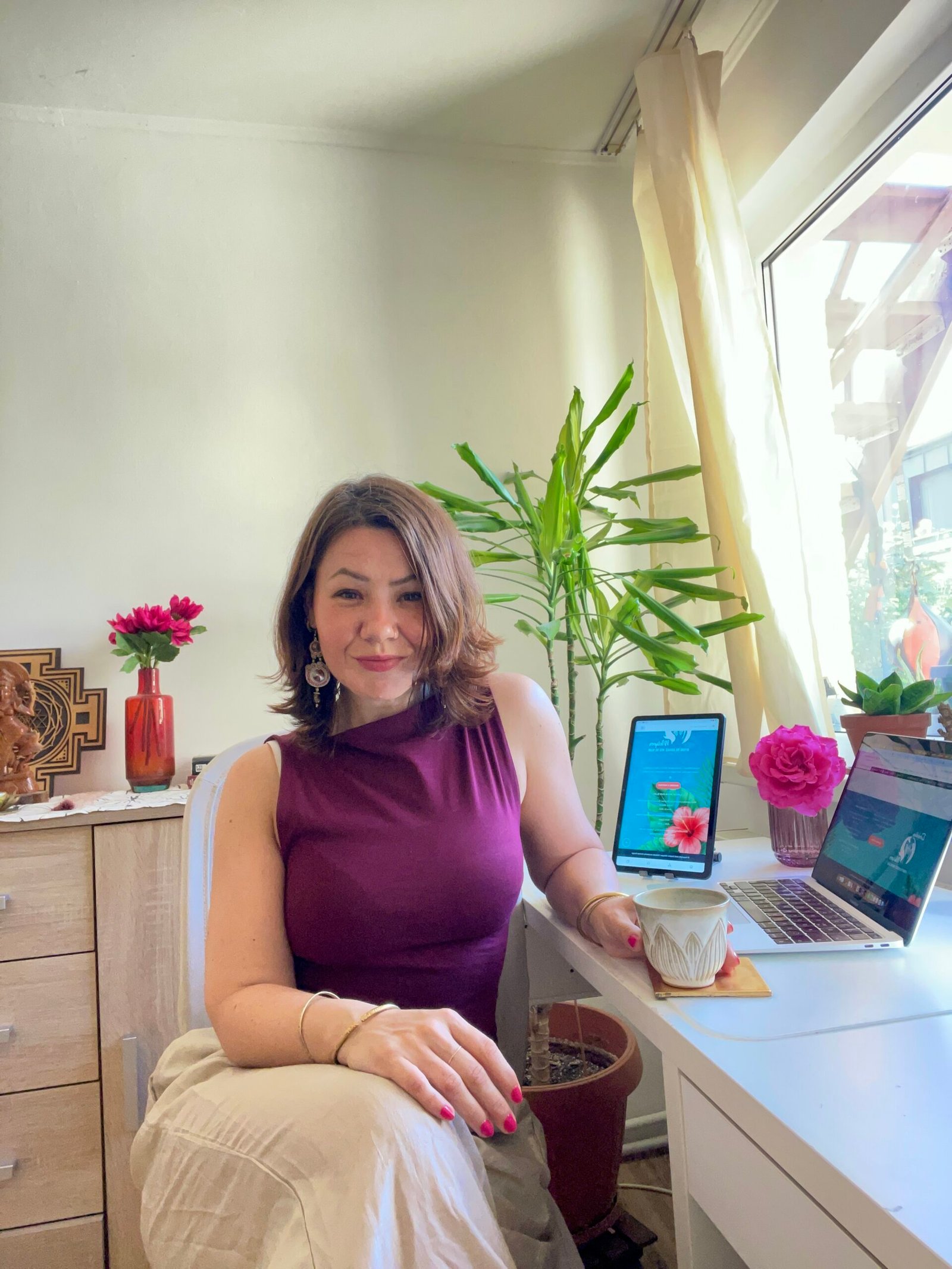
I’m Yoli, a brand identity designer and brand mentor focused on visual alignment.
I have 14+ years of design experience, plus studies and background in communication, PR and NGO management. That mix brings structure, strategy and precision into my work, alongside depth, creativity and originality.
In recent years, my work expanded beyond execution. I now combine design with 1:1 guidance that clarifies direction first, so your brand can reflect its true essence in a clear visual form.
“Yoli has a rare ability to truly understand your brand and translate it into visual language that feels both authentic and impactful.”
Shared by a valued, long-term client.
I work with conscious entrepreneurs, creatives, and founders who want their presence to feel true on the outside and aligned on the inside.
Get in touch if you want a brand that’s unmistakably yours.