AVA - Light Art Brand at a Glance

 HOLISTIC LOGO DESIGN

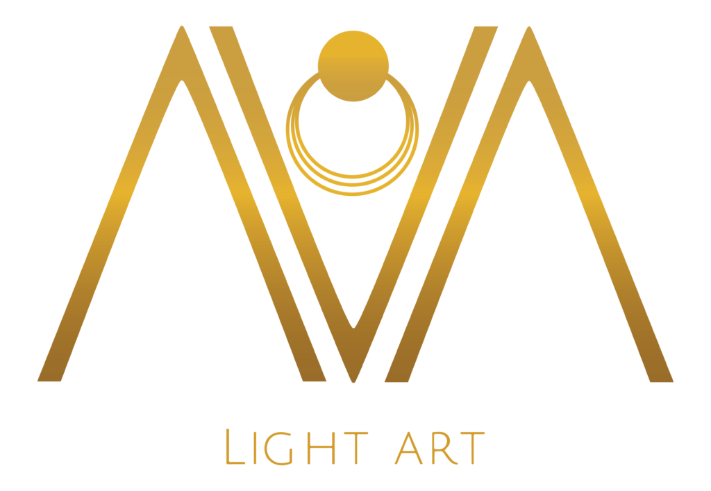
The holistic logo design for AVA Light Art translates healing, intuition and light into a refined visual.

It reflects the brand’s essence: handcrafted healing jewellery that serves as a daily reminder of one’s inner light and soul’s essence.

Brand: AVA Light Art

Location: Texas, USA

Field: Healing Jewellery & Energy Work

Services: Logo Design

AVA Light Art creates handcrafted crystal jewellery infused with intention, combining artistry with energetic healing. Every piece is thoughtfully designed around the client’s personal journey, becoming a meaningful talisman created to support healing, protection and remembrance of one’s inner light.

Based in Melanie’s background in nursing, meditation, Reiki and intuitive healing, the brand reflects a deep respect for the transformative power of crystals and conscious creation. Each jewel begins with connection and intention before being handcrafted and energetically aligned through prayer and healing work.

My role was to translate this philosophy into a design that feels elegant, luminous and timeless. Rather than illustrating jewellery itself, the logo expresses light, presence and sacred adornment through a simple symbolic composition that allows the deeper meaning of the brand to shine.
Essence: What AVA - Light Art Stands For

AVA Light Art exists at the intersection of craftsmanship and healing. Every piece is individually created through a collaborative process where intention, intuition and energy guide each design decision.

The brand speaks to people seeking jewellery with personal meaning and pieces that honour important life transitions, support inner growth and serve as gentle reminders of their own essence.

Rather than following trends, AVA Light Art celebrates timeless beauty, authenticity and conscious living.

Design Direction: Light & Radiant

 On the energetic map, AVA – Light Art is:

Luminous. Elegant. Intuitive

Every design decision was guided by AVA Light Art’s intention to create jewellery that feels refined yet deeply personal. The design balances minimalist geometry with symbolic meaning, allowing the logo to communicate sophistication and spiritual depth without relying on obvious esoteric imagery.

Symbol Concept – Ring+Concentric circles

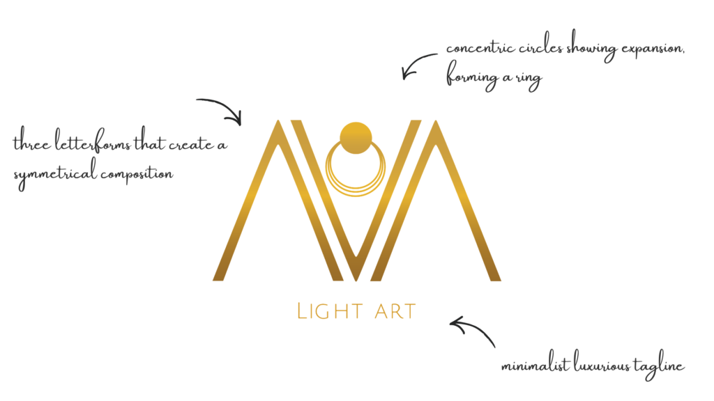
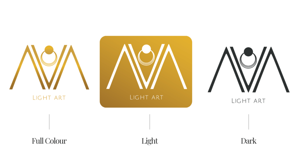
The logo combines the initials A V A into a harmonious monogram that becomes both a wordmark and a symbol.

At its centre, a luminous ring represents the inner light, while the delicate concentric rings beneath evoke energetic expansion, resonance and the subtle fields of healing that surround every individual. Together, these elements create a visual metaphor for light radiating outward from the soul.

Rather than depicting crystals or jewellery directly, the symbol expresses the energetic qualities that define the brand: presence, healing, intuition and transformation.

Logo Arhitecture

The identity is constructed around a balanced geometric framework where the three letterforms create a symmetrical composition.

The centred circle naturally becomes the focal point, while the repeated curves introduce softness that complements the angular structure of the monogram. This balance between geometry and fluidity reflects the harmony between craftsmanship and intuitive creation.

Colour World – Radiant Gold

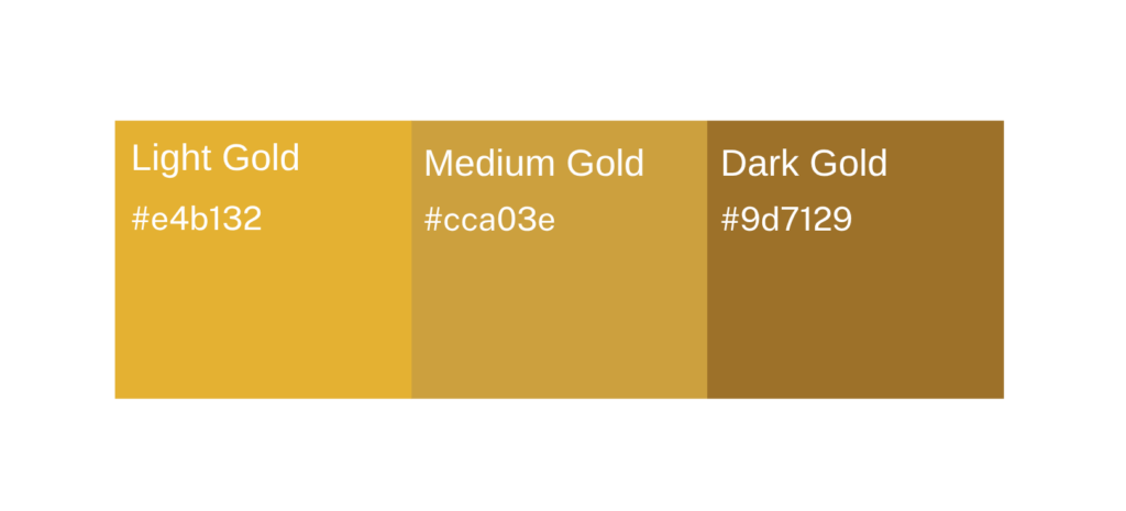
 A gradient of three gold tones was selected as the sole brand colour to communicate light, refinement and enduring value.

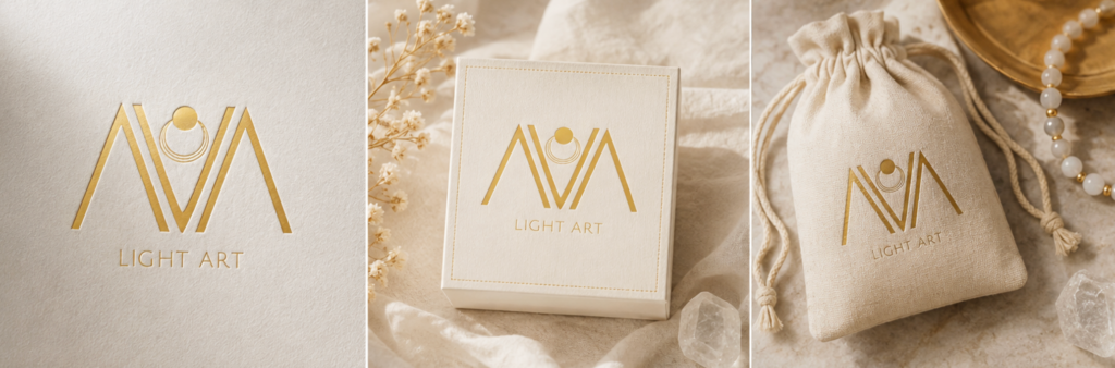
Associated with illumination, wisdom and precious craftsmanship, it reflects both the beauty of fine jewellery and the transformative nature of the healing journey. Used consistently across every touchpoint, the palette creates a recognisable and timeless identity.

Typography – Timeless Simplicity

The original logo featured Melanie’s own handwriting, carefully redrawn into vector form to preserve the personal character of the brand and strengthen the connection between the artist and her work.

As AVA Light Art evolved over the following years, the typography was refined into a more minimalist direction, allowing the symbol to take centre stage while giving the brand a cleaner, more contemporary presence.

This evolution demonstrates how a visual identity can mature alongside a growing business without losing its essence.

Primary Typeface: Custom Font

Secondary Typeface: Julius Sans One font

Client Experience

“I had the honor to get my logo done from Yoli. After a call she sent me questions to clarify my wishes. And in one afternoon she already had the first sample done, which really touched me. Yoli is a channel of pure creativity. Her work and the ability to bring the wishes for the logo to the paper made me more than happy. She is reliable and communicated openly to make sure that all is in resonance with the customer wishes until the end of the process.”
Melanie

How This Kind of Design Supports a Business

A considered holistic logo design and visual identity change how a business shows up every day.

What it gives the brand:

  • A recognizable face on: website, socials, documents, signage.

  • A coherent language of logo, color and type, so everything looks like it belongs to the same business.

  • Decision ease: no more guessing fonts, colours or styles for every new asset.

  • Higher perceived value: a brand that looks intentional supports better pricing and better clients.

  • Confidence for the founder: you know what your brand looks like, so you can focus on the work itself.

A proprietary process blending strategy, symbolism and essence mapping — shared in full with confirmed clients

How I build it

  • We start with the essence of the work: who you serve, what you stand for, and how you want people to feel.

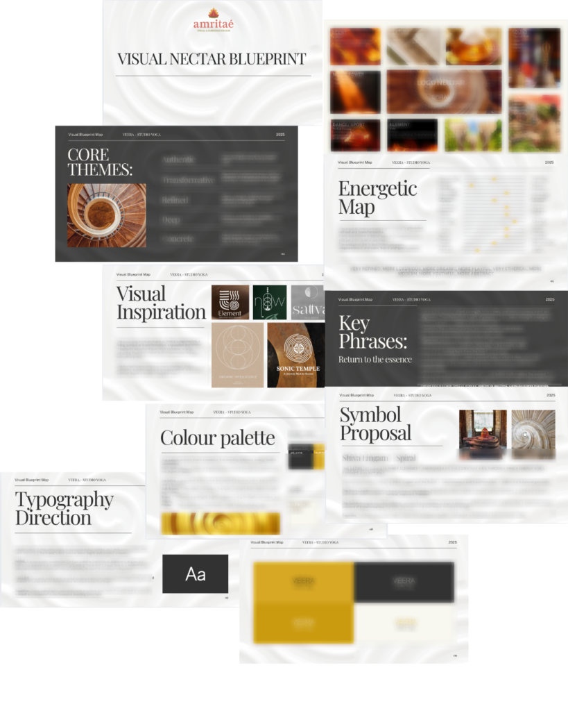
  • I create a visual blueprint that maps symbols, mood, typography and color into a structured system.

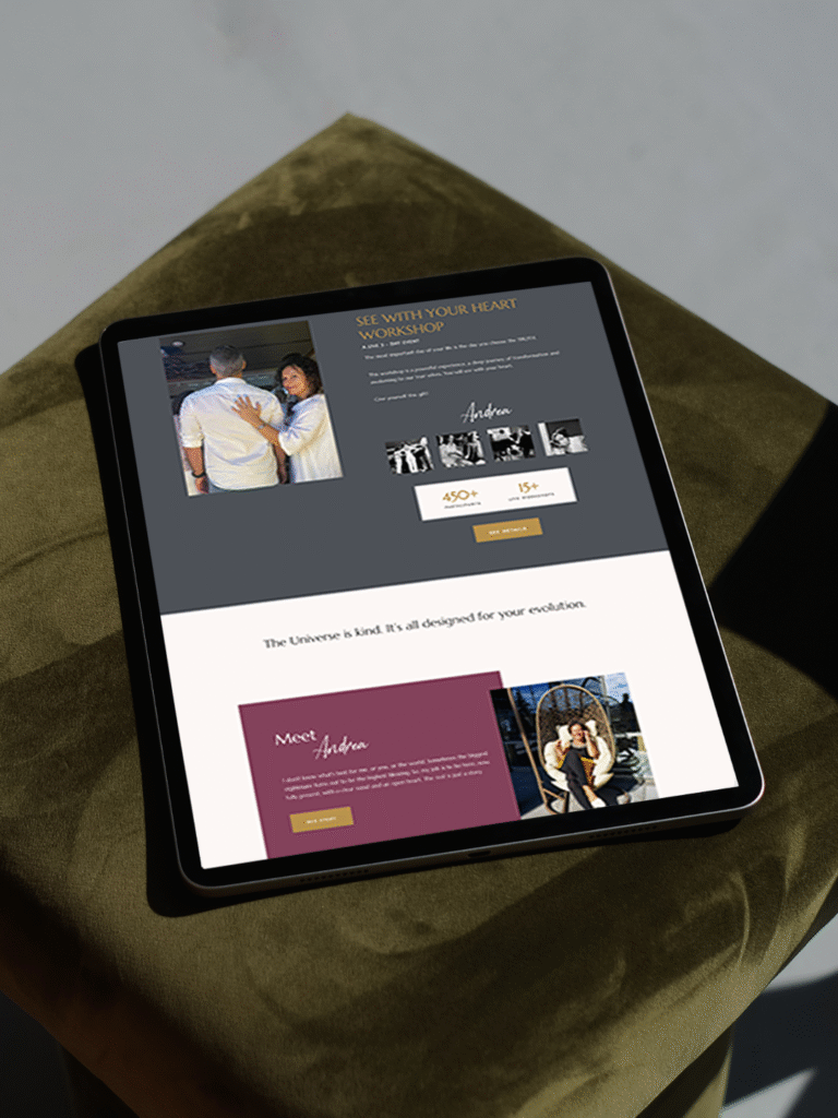
  • From there, I design the logo and core identity elements and test them in real contexts: website, social, print.

  • You receive a compact, usable identity kit you can actually work with: logo files, color codes, type system and key applications.

This is bespoke work, built to hold the depth of what you do and to be usable in real life, day after day.

Logo Design & Visual Identity · Web Design · Brand Mentorship

Your brand can be this aligned.
Translate Your Brand’s Essence Into Form

Founder

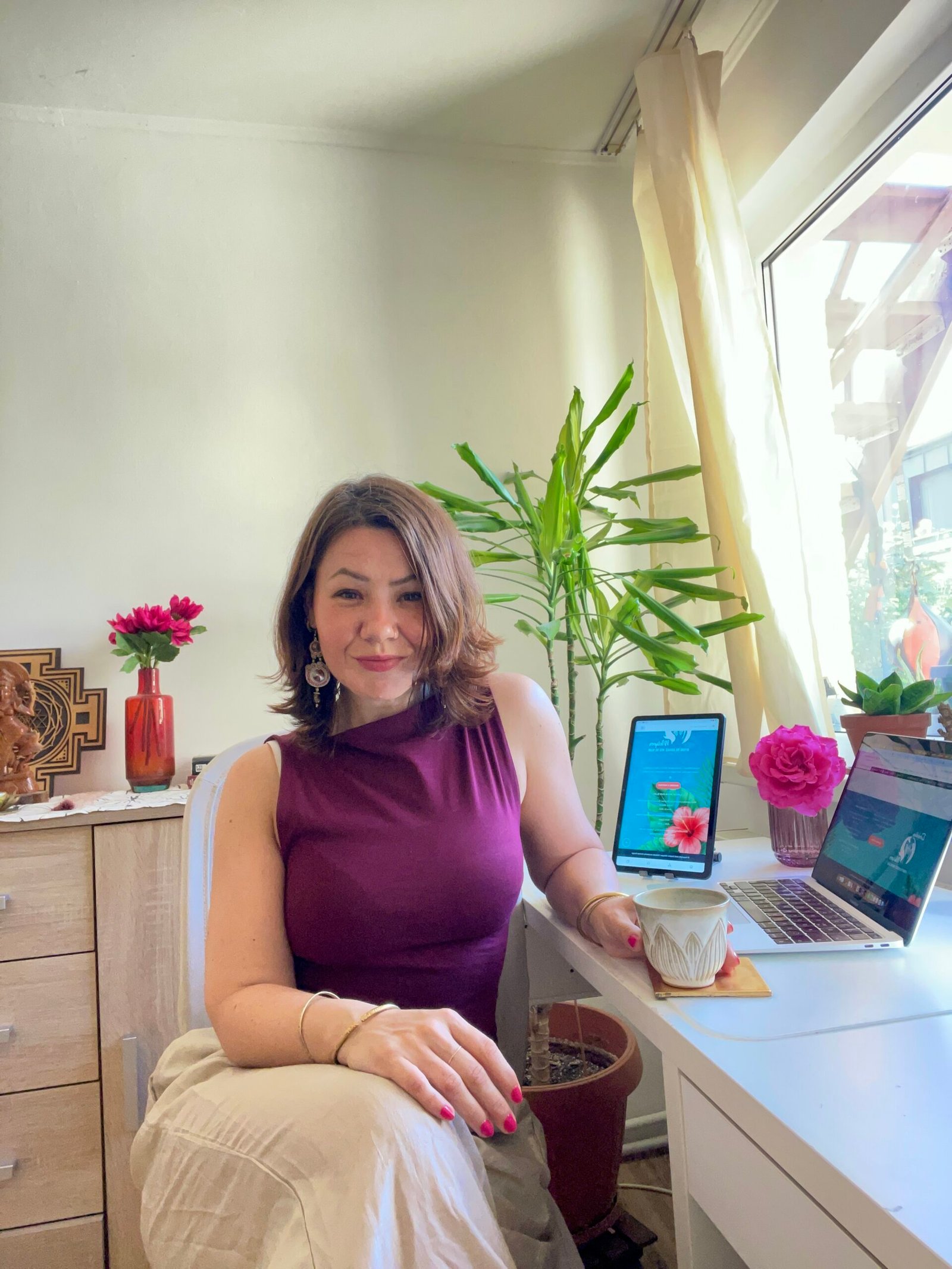
Yoli Amritaé

I’m Yoli, a brand identity designer and brand mentor focused on visual alignment.

I have 14+ years of design experience, plus studies and background in communication, PR and NGO management. That mix brings structure, strategy and precision into my work, alongside depth, creativity and originality.

In recent years, my work expanded beyond execution. I now combine design with 1:1 guidance that clarifies direction first, so your brand can reflect its true essence in a clear visual form.

“Yoli has a rare ability to truly understand your brand and translate it into visual language that feels both authentic and impactful.”
Shared by a valued, long-term client.

I work with conscious entrepreneurs, creatives, and founders who want their presence to feel true on the outside and aligned on the inside.

Get in touch if you want a brand that’s unmistakably yours.

Scroll to Top