Dolphin Whisper Brand at a Glance

VISUAL IDENTITY, LOGO DESIGN & WEB DESIGN

The visual identity and website design for Dolphin Whisper were created for a project dedicated to changing the way people encounter and understand dolphins.

Brand: Dolphin Whisper
Field: Dolphin & ocean advocacy / Ethical encounters / Marine education
Services: Visual Identity, Logo Design, Web Design
Focus: Ethical dolphin encounters, education, conservation and respectful human–dolphin connection.

Dolphin Whisper is an educational NGO-in-creation, focused on dolphin wellbeing and responsible travel choices.

Far from promoting dolphins as an attraction, Dolphin Whisper encourages respectful encounters that give wild dolphins the freedom to choose whether and how they interact with humans.

The identity and web design translate this philosophy into a visual language inspired by the ocean, movement, connection and the relationship between humans and the natural world.

Essence: What Dolphin Whisper Stands For

Dolphin Whisper was created from a deep personal connection with dolphins and the founder’s experience working as a maritime guide and diver, alongside her path in reflexology, Reiki and spirituality.

At the heart of the project is a simple but powerful idea: a genuine encounter can only happen when the dolphin has the freedom to choose it.

The brand challenges the assumptions surrounding dolphin tourism and advocates for encounters based on respect, awareness and observation rather than control.

The visual identity needed to communicate this message without becoming overly literal or adopting the familiar visual language of marine tourism.

Design Direction: Translating Connection Into Form

The creative direction explored the relationship between two worlds: human and animal, land and ocean, physical and energetic.

On the energetic map, Dolphin Whisper is:

modern, mature, simple, abstract, organic and empowering

The ocean is the central visual environment, expressed through water, fine wet sand, movement and aquatic imagery. The dolphin represents agility, wisdom and resilience while the yin-yang concept introduces balance, harmony and unity. 

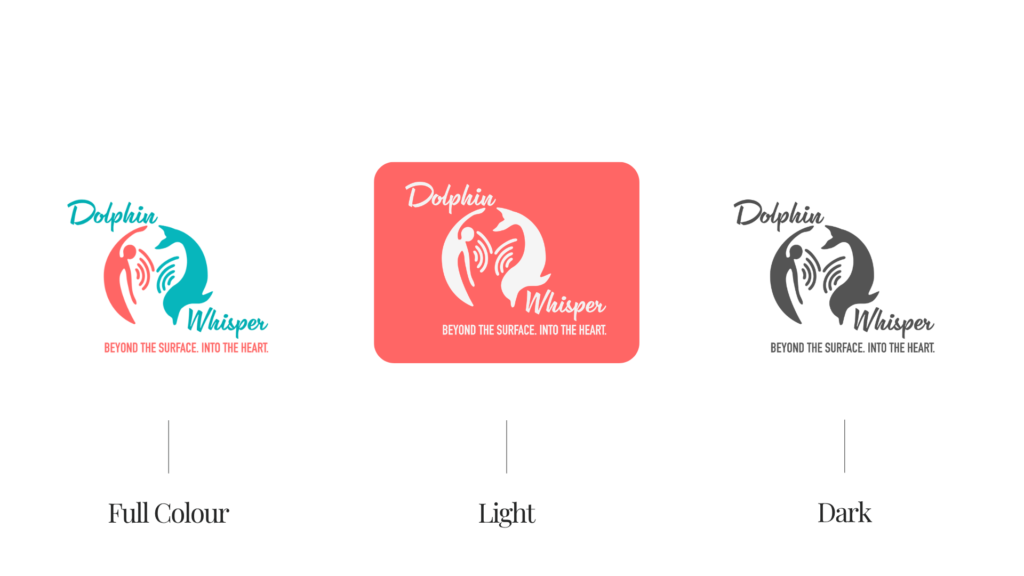
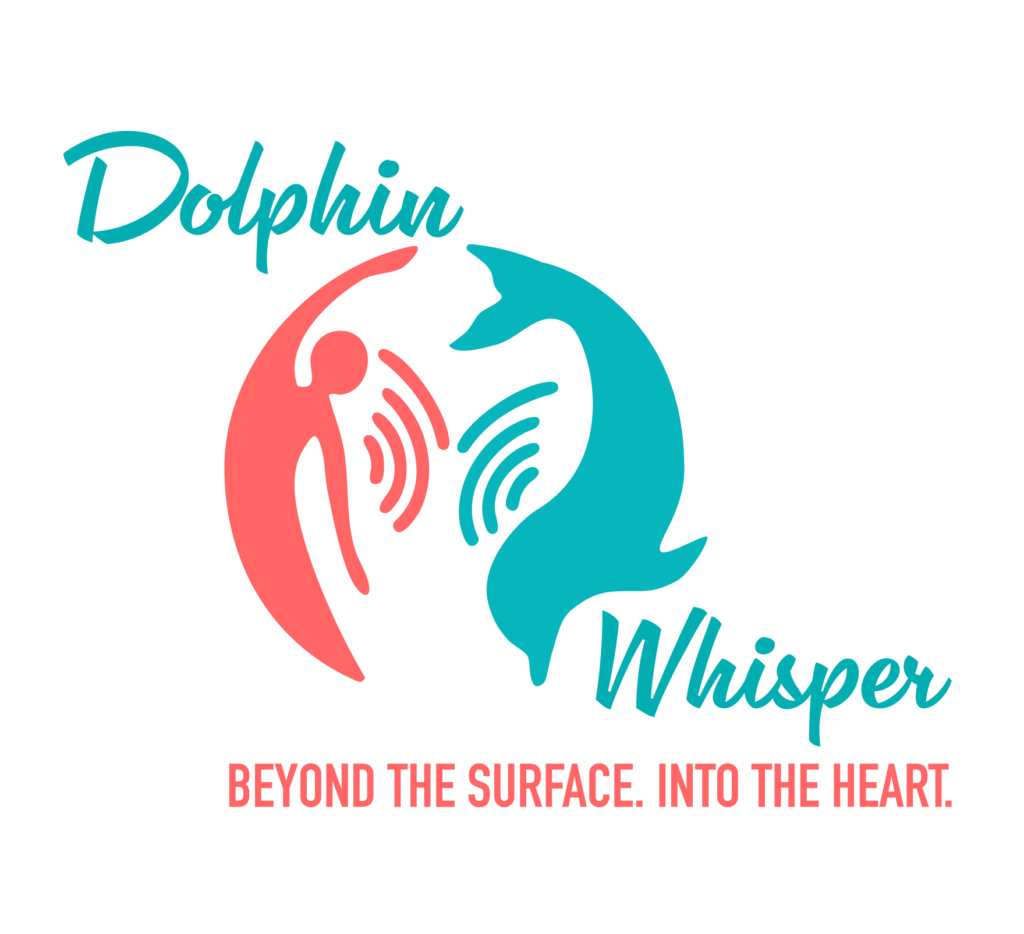
The Logo Symbol Concept – Dolphin+Human+Yin/Yang +Connection

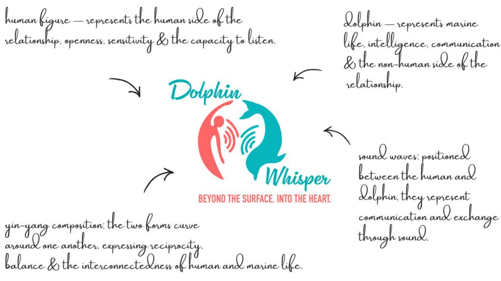
The Dolphin Whisper symbol is formed by a human and a dolphin moving together in a yin-yang configuration.

The concept represents duality and unity: wild and human, energy and matter, ocean and land. The circular movement creates a sense of continuity and connection.

Rather than depicting a dolphin as an isolated icon, the symbol makes the relationship between humans and dolphins itself the central idea.

The human and dolphin face one another and create a dynamic circular movement, suggesting communication, reciprocity and an encounter that happens between two participants, with proper distance and respect.

Between them there is a bond, because Dolphin Whisper isn’t just marine conservation.

There is something experiential and almost mystical about the idea of “whispering” and communicating with dolphins.  

Logo Arhitecture

Human + dolphin + communication, brought together through a yin-yang-inspired form.

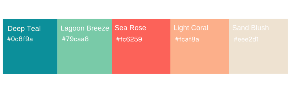
Colour World – Ocean, Water & Sea Rose

The colour palette brings together the different environments and emotions within the Dolphin Whisper world.

A family of seafoam, turquoise and deep teal shades creates the oceanic foundation of the identity. Coral and soft blush tones introduce warmth and a more human, feminine quality without taking the visual language away from the sea.

The palette developed from the original visual direction includes:

Deep Teal ·  Lagoon Breeze · Sea Rose · Sand Blush · Light Coral

Typography – Organic & Fluid

The typography combines a distinctive serif with more fluid handwritten elements and clean supporting type.

The serif brings a sense of maturity and editorial character while the handwritten treatment introduces movement and personality.

This balance reflects the dual nature of Dolphin Whisper itself: serious in its message, yet deeply connected to nature, emotion and movement.

The typography was designed to work across both educational content and more expressive brand communication.

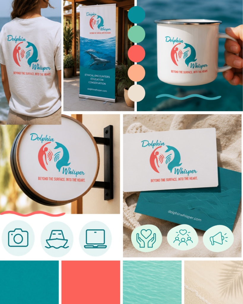
The Visual Identity System

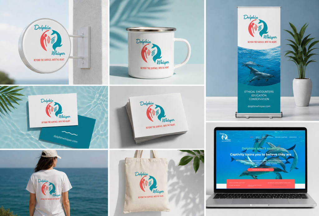
The identity extends beyond the logo through a flexible combination of:

  • Ocean photography
  • Turquoise and coral colour fields
  • Organic wave shapes
  • Fine sand and water textures
  • Serif typography
  • Handwritten accents
  • Dolphin imagery
  • Circular and flowing graphic forms

This creates a visual system that can communicate different sides of the project — from educational information about dolphins and captivity to travel, ethical encounters and personal stories — while remaining recognisably Dolphin Whisper.

The original visual direction also explored textures and sensory associations such as wet fine sand, cacao, water and aquatic movement, giving the identity a more tactile and experiential quality.

From Identity to Communication

The project extended beyond the visual identity into the way Dolphin Whisper communicates its work online.

I worked closely with Stephanie to structure the website, organise the pages and finalise the content, creating a clear journey through the organisation’s different areas of work.

I helped determine what needed to be communicated, how the information should be organised and how each page should contribute to the larger story.

The structure brings together Dolphin Whisper’s educational work, conservation efforts, ethical dolphin tourism, resources and other initiatives within one coherent experience.

In this way, the website gives its ideas, resources and initiatives a clear structure through which people can discover, understand and engage with the work.

Web Design

Bringing Dolphin Whisper Online

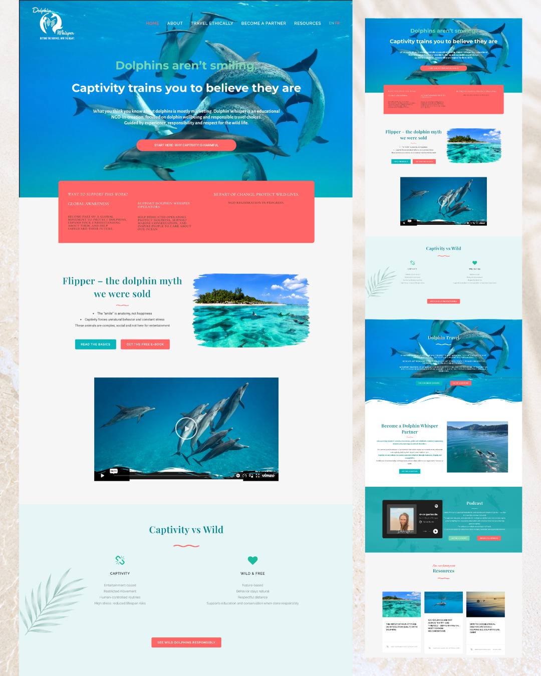
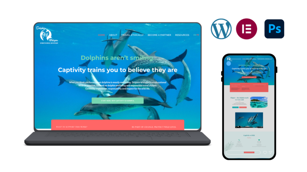
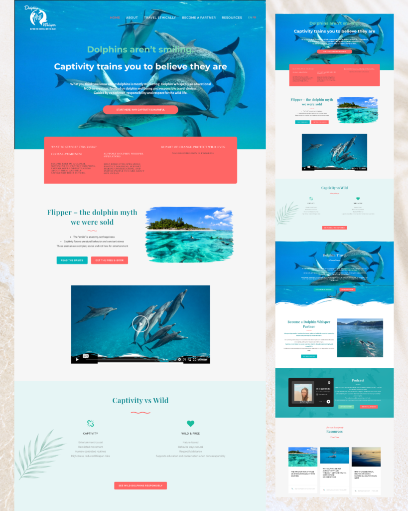
The website translates the visual identity into a digital experience designed to educate visitors, communicate the philosophy behind Dolphin Whisper and guide them toward meaningful action.

The website brings together several aspects of the project: dolphin education, ethical encounters, resources, advocacy, partnerships and the founder’s voice.

The design uses large-scale ocean imagery, turquoise sections, soft neutral backgrounds and coral accents to create a visual rhythm between information-heavy and more immersive sections.

Designing for Education & Action

The website needed to do more than present information.

Visitors are introduced to Dolphin Whisper’s central message and then guided through different ways of engaging with the project — from learning about dolphins in captivity and in the wild to discovering resources, listening to the podcast, becoming a partner or learning how they can help.

This creates a journey from awareness → understanding → participation.

The visual hierarchy keeps calls to action visible without allowing them to overpower the educational content.

A Digital Expression of the Brand

The website carries the same principles established in the visual identity:

Movement through flowing forms and ocean imagery.
Connection through the relationship between photography, typography and content.
Balance through the contrast of turquoise and coral with softer neutral backgrounds.
Respect for nature through imagery that places dolphins within their natural environment rather than presenting them as entertainment.

The result is a website that feels like an extension of the Dolphin Whisper world rather than a separate digital layer.

Client Experience

Amritaé accompanied me through the creation of my logo and the design of my website, and I'm very happy with the result. Beyond the outstanding professionalism and quality of her work, what touched me most was her unique ability to perceive what lies behind words, the vibration, energy, and essence I wanted to bring to my projec, and translate it into design. When I saw the first nearly completed version of my website, my immediate reaction was: "This is so me!" The website feels authentic, aligned, and truly reflects who I am and what my project stands for. Bravo!!!, and thank her for her work and our collaboration.
Stephanie

How This Kind of Design Supports a Business

A considered holistic logo design and visual identity change how a business shows up every day.

What it gives the brand:

  • A recognizable face on: website, socials, documents, signage.

  • A coherent language of logo, color and type, so everything looks like it belongs to the same business.

  • Decision ease: no more guessing fonts, colours or styles for every new asset.

  • Higher perceived value: a brand that looks intentional supports better pricing and better clients.

  • Confidence for the founder: you know what your brand looks like, so you can focus on the work itself.

A proprietary process blending strategy, symbolism and essence mapping — shared in full with confirmed clients

How I build it

  • We start with the essence of the work: who you serve, what you stand for, and how you want people to feel.

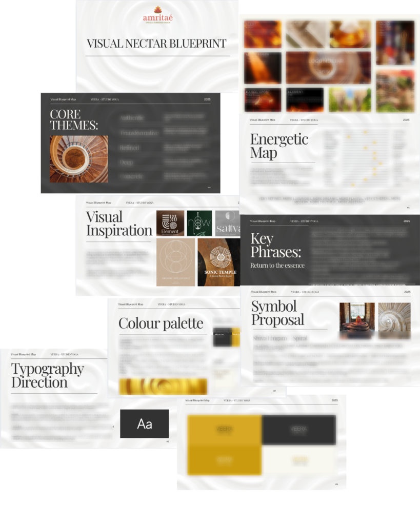
  • I create a visual blueprint that maps symbols, mood, typography and color into a structured system.

  • From there, I design the logo and core identity elements and test them in real contexts: website, social, print.

  • You receive a compact, usable identity kit you can actually work with: logo files, color codes, type system and key applications.

This is bespoke work, built to hold the depth of what you do and to be usable in real life, day after day.

Logo Design & Visual Identity · Web Design · Brand Mentorship

Your brand can be this aligned.
Translate Your Brand’s Essence Into Form

Founder

Yoli Amritaé

I’m Yoli, a brand identity designer and brand mentor focused on visual alignment.

I have 14+ years of design experience, plus studies and background in communication, PR and NGO management. That mix brings structure, strategy and precision into my work, alongside depth, creativity and originality.

In recent years, my work expanded beyond execution. I now combine design with 1:1 guidance that clarifies direction first, so your brand can reflect its true essence in a clear visual form.

“Yoli has a rare ability to truly understand your brand and translate it into visual language that feels both authentic and impactful.”
Shared by a valued, long-term client.

I work with conscious entrepreneurs, creatives, and founders who want their presence to feel true on the outside and aligned on the inside.

Get in touch if you want a brand that’s unmistakably yours.

Scroll to Top