Empathic Bodywork Brand at a Glance

 YOGA LOGO DESIGN

Brand: Empathic Bodywork

Field: Somatic Healing, Body–Mind Integration

Services: Logo Design

Tone: Ancient, powerful, geometric, embodied

Core Idea: Integrating sacred geometry with somatic wisdom, the union of body, spirit and consciousness through design.

Empathic Bodywork is a therapeutic practice that blends modern somatic awareness with ancient energetic wisdom. Based in body-centered healing, it guides individuals toward authenticity, presence and self-understanding.

The brand required a visual identity that expresses grounded depth and spiritual expansion, a geometry that feels ancient yet alive.

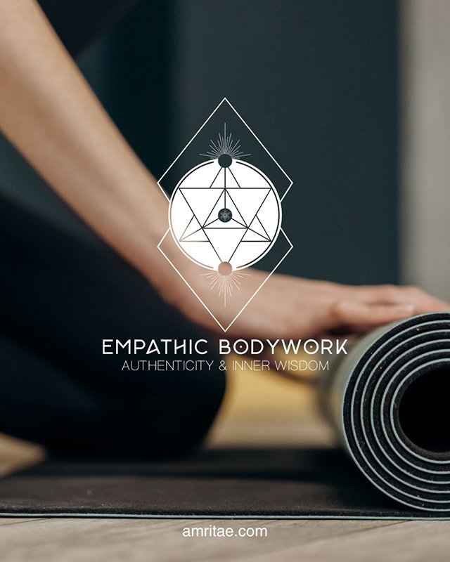
Empathic Bodywork yoga logo design

Essence: What Empathic Bodywork Stands For

Empathic Bodywork stands for embodied wisdom: the art of listening to the body as a gateway to consciousness.

It represents a path of returning to one’s authentic self through presence, awareness and movement.

At its core, the brand embodies the belief that true healing emerges not from correction but from reconnection, from feeling what has been forgotten and integrating it into wholeness.

It honours the intelligence of the body, where every sensation, boundary and movement becomes a teacher.

Visually, the brand translates this philosophy into a geometric language of balance and flow, where the unseen becomes visible through structure and light.

Design Direction: Ancient, Grounded, Expansive

 On the energetic map, Empathic Bodywork is:

Wild and free | Wise and grounded | Abstract and sacred | Transformative and alive

The design merges wilderness with structure, natural intelligence with geometric order.

It channels a sense of ancient wisdom remembered through form: sacred geometry as a mirror for embodied consciousness.

Symbol Concept – Tetrahedron + Chakras + Metatron's Cube + Roots & Rays

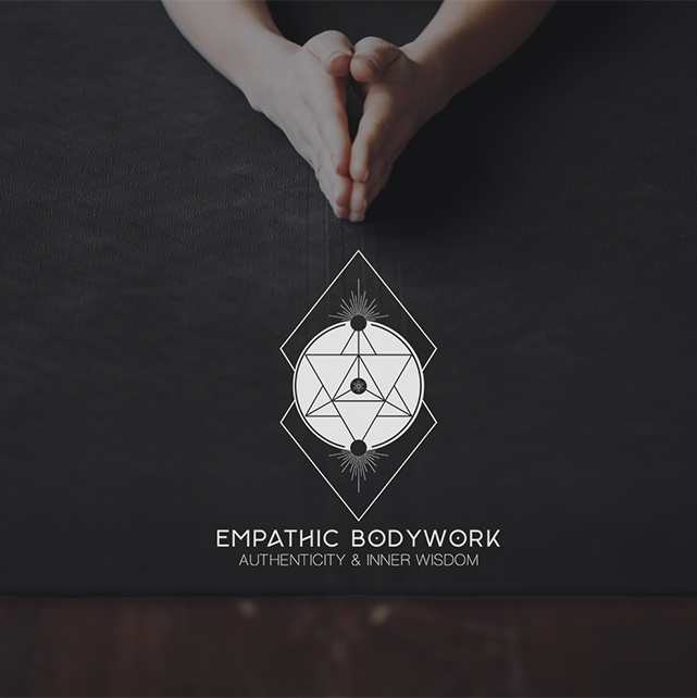
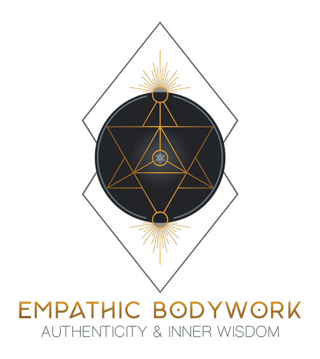
The Empathic Bodywork logo is a geometric mandala expressing the journey from embodiment to awakening.

It is built upon principles of sacred geometry:

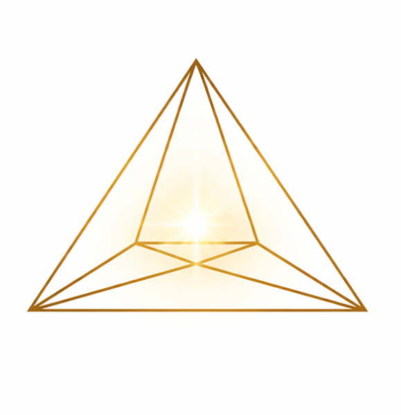
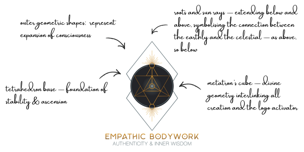
  • The tetrahedron – the central sacred geometry shape, symbolizing spiritual transformation, ascension and stability. It reflects balance between the physical and energetic worlds.

  • Metatron’s cube – subtly integrated at the core, acting as a divine activator; it contains every geometric form in creation.

  • Three dots (center top and bottom) that are the energy poles, like chakra points connecting above and below.

  • Roots and sun rays – extending below and above, symbolising the connection between the earthly and the celestial, as above, so below, emerging from darkness into light.

  • Outer Geometric Shapes expanding outside the circle represent  expansion of consciousness.

Together, these elements create a structure that is both sacred and raw.

Logo Arhitecture

An architectural balance of form and freedom, expressing inner alignment through sacred geometry.

Colour World – Grounded & Expansive

The palette for Empathic Bodywork combines depth, maturity and natural resonance.

Each tone was chosen to reflect the stability of the earth and the freedom of the sky, mirroring the journey from grounding to expansion that defines the brand’s philosophy.

Colour Palette

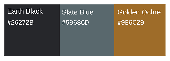
Earth Black (#242428) – Represents grounded wisdom, stability and the depth of embodied awareness.

Golden Ochre (#A36D2E) – Symbolises warmth, transformation and the golden light of consciousness emerging from within.

Slate Blue (#56666C) — Reflects introspection and connection to the unseen, the contemplative tone of healing work.

Together, these hues create a palette that is both raw and refined.


Typography – Refined & Elemental

The main logotype uses Monad, a contemporary serif font with structured elegance and organic flow. Its balanced geometry reflects intellect and raw intuition.

The tagline is set in a clean, sans-serif style, adding clarity and grounded simplicity to support the sophistication of the main font.

Together, they create a visual rhythm that feels both professional and soulful.

Client Experience

I knew I found the right graphic designer from the very first moment I saw her website. Yoli has an amazing and unique way to work with clients. She made me think about my business in a way I would never imagined and now I feel so clear about my path I just started. She is doing magic and she has a wonderful sense of searching for the nectar. I really appreciate how she brought my ideas to life and how I can find myself in the logo. This was such a wonderful process! Yoli, thank you with all my heart for your work.
Carolin
Empathic Bodywork

How This Kind of Design Supports a Business

 A considered logo and visual identity change how a business shows up every day.

It’s not decoration. It’s structure.


What it gives the brand:

  • A recognizable face on: website, socials, documents, signage.

  • A coherent language of logo, color and type, so everything looks like it belongs to the same business.

  • Decision ease: no more guessing fonts, colours or styles for every new asset.

  • Higher perceived value: a brand that looks intentional supports better pricing and better clients.

  • Confidence for the founder: you know what your brand looks like, so you can focus on the work itself.

A proprietary process blending strategy, symbolism and essence mapping — shared in full with confirmed clients

How I build it

  • We start with the essence of the work: who you serve, what you stand for, and how you want people to feel.

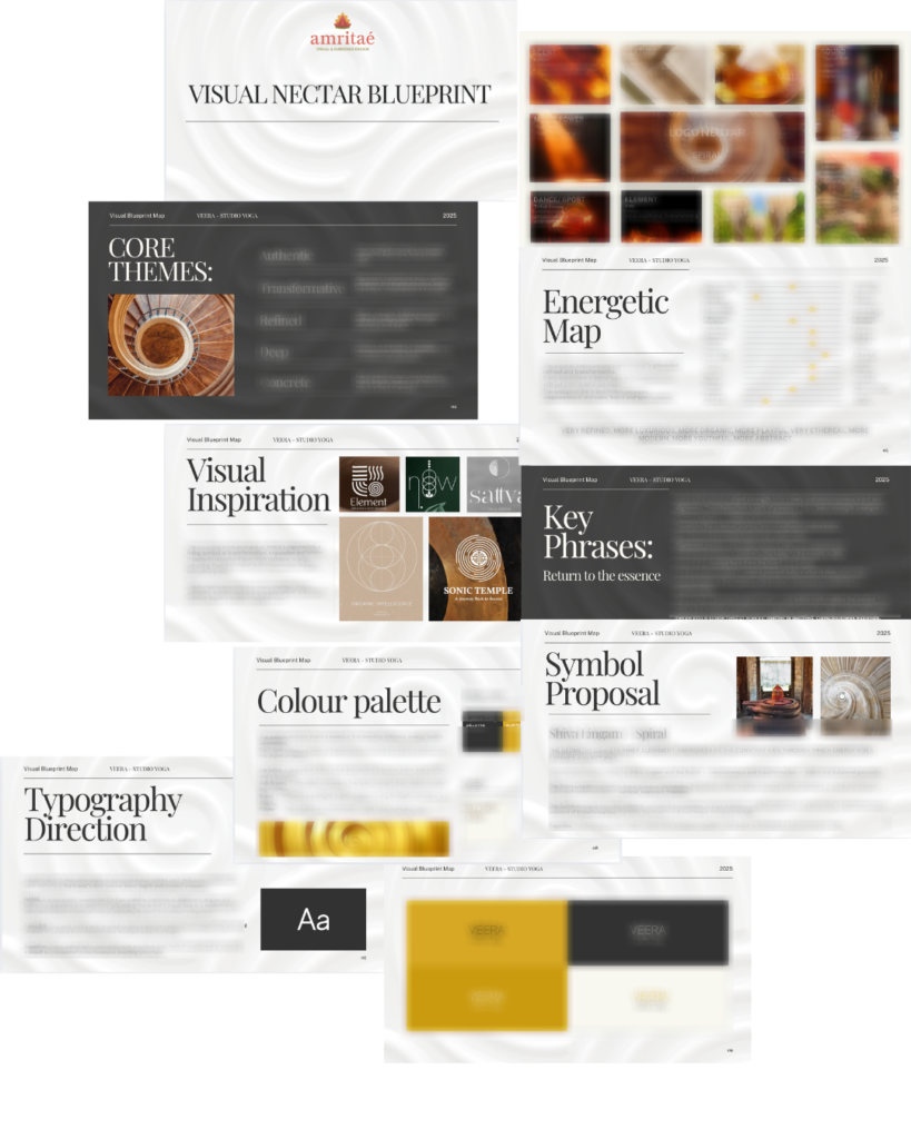
  • I create a visual blueprint that maps symbols, mood, typography and color into a structured system.

  • From there, I design the logo and core identity elements and test them in real contexts: website, social, print.

  • You receive a compact, usable identity kit you can actually work with: logo files, color codes, type system and key applications.

This is bespoke work, built to hold the depth of what you do and to be usable in real life, day after day.

Your brand can feel this aligned

Ready for your own logo design/complete visual identity?

If this project resonates and you want your own logo and visual identity made with the same depth, let’s build it together.

Yoli, founder of Amritaé Design, working at her desk with a laptop and digital pen in a softly lit studio space.

Founder

Yoli Amritae

I’m Yoli, a brand identity designer and brand mentor focused on visual alignment.

I have 14+ years of design experience, plus studies and background in communication, PR and NGO management. That mix brings structure, strategy and precision into my work, alongside depth, creativity and originality.

In recent years, my work expanded beyond execution. I now combine design with 1:1 guidance that clarifies direction first, so your brand can reflect its true essence in a clear visual form.

“Yoli has a rare ability to truly understand your brand and translate it into visual language that feels both authentic and impactful.”
Shared by a valued, long-term client.

I work with conscious entrepreneurs, creatives, and founders who want their presence to feel true on the outside and aligned on the inside.

Get in touch if you want a brand that’s unmistakably yours.

Scroll to Top