inSpirit Brand at a Glance

 HOLISTIC LOGO DESIGN

Brand: in Spirit – Sound & Vibration Healing Circles

Location: Ireland

Field: Sound Healing

Services: Logo Design

In Spirit represents a collective of sound and energy practitioners dedicated to guiding people back to their inner equilibrium through vibration and resonance. Their work brings together diverse healing modalities such as sound baths, Reiki and shamanic practices, all centred on presence, connection and the intelligence of the body.

In Spirit – Sound & Vibration Healing Circles offers sound-based therapeutic experiences that help individuals reconnect with their inner equilibrium through vibration and resonance.

The founders envisioned a logo that conveys healing, balance, and depth, expressed through a refined and intuitive visual language.

The goal was to create a symbol that evokes a sense of homecoming — warmth, authenticity, and empowerment — while maintaining elegance and structural clarity. The result is a design that feels feminine yet strong, intuitive yet composed, embodying both the softness of healing and the precision of sound work.

My role was to design a logo that communicates this integration of depth and sophistication: a modern mark that feels both professional and deeply human.

Explore this project on Behance. If you enjoyed it, tap the like button to appreciate the project and help it reach more creatives.

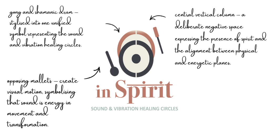
Essence: What in Spirit Stands For

At its core, In Spirit embodies transformation through vibration: the process of returning to one’s true state through resonance and presence.

The brand stands for healing that is experiential rather than conceptual: the kind that happens in the body, in the pause between sounds. It connects the divine and the practical, creating a bridge between energy and structure, intuition and form.

Visually, the identity had to express warmth and trust, qualities that reflect the experience of being held in a safe, restorative environment. The goal was not to illustrate spirituality, but to translate the felt sense of inner alignment into visual form.

Design Direction: Refined, Resonant, Grounded

 On the energetic map, in Spirit is:

Grounded and refined | Deeply resonant | Warm and professional | Intuitive and balanced

The design brings together sound and matter, visualizing vibration as movement, rhythm and expansion.

The typography and symbol reflect strength and simplicity, avoiding decorative excess.

Instead of relying on conventional “spiritual” symbols, the system is built from natural textures, elemental shapes, and timeless resonance, expressing the raw power of sound that heals from within.

Symbol Concept – Gong & Shamanic Drum + Vertical Column

The gong & shamanic drum merge into a single cohesive symbol, representing the harmony between sound and vibration. 

A vertical column of negative space runs through the centre, symbolising alignment and the presence of Spirit. This vertical axis anchors the composition, creating both visual and energetic equilibrium.

The opposing mallets introduce a sense of motion and rhythm, illustrating sound as energy in movement. Their mirrored placement conveys expansion and release, the process through which vibration restores harmony within the body and mind.

The result is a refined and intentional mark that captures the dual nature of the brand: calm and grounded, yet resonant and alive.


Logo Arhitecture

The architecture of the In Spirit logo integrates the gong and shamanic drum into one unified form, structured around a central axis representing stillness and presence. The mallets create dynamic diagonal movement, symbolising vibration and resonance in action.

Colour World – Warm & Elegant

The colour system of In Spirit evokes harmony between grounding and elevation — tones inspired by nature and sound.

Each shade was selected to mirror the emotional and physical aspects of sound healing: balance, expansion and relaxation.

Colour Palette

Dusty Rose (#C47E76): Represents warmth, care and emotional presence; the human element of connection.

Soft Sage — combines the muted calm of sage with a cool, silvery undertone that feels grounded and elegant.

Deep Grey (#595956): Echoes the metallic resonance of gongs — strength, structure and depth.

Warm Sand (#D5B896): Brings in grounding and trust, anchoring the overall atmosphere.

Together, the palette forms a bridge between earth and vibration, tactile and ethereal — an aesthetic both modern and timeless.


Typography – Timeless & Elegant

The typography for In Spirit combines classical refinement with modern readability.

The main wordmark uses Bodoni 72 Oldstyle (customised) — a timeless serif chosen for its elegance. I have made a subtle adjustment to the letterforms with Indian style line above the letters. 

The tagline uses Calibri, a clear and grounded sans-serif that complements the refined main font.

Together, they create a system that feels approachable, and harmonised.

Client Experience

"Yoli had already created a wonderful logo for my husband & friend (Sonic Temple Music ) so I had no doubts who to ask for this logo. I love Yoli's method of extracting thoughts and feeling's and together we can create the final piece. She has an inner knowing without words of the vision being expressed and the whole process from start to finish was a beautiful heartfelt deep experience. Actually, a lot came up in the whole process and each piece of the logo has its own meaning. Yoli is very unique in this world of logo making and would recommend this creative process to anyone looking for something special. We really love this new creation. Thank you so much Yoli and it was such a blessing to work with you."
Nicola
in Spirit

How This Kind of Design Supports a Business

 A considered logo and visual identity change how a business shows up every day.

It’s not decoration. It’s structure.


What it gives the brand:

  • A recognizable face on: website, socials, documents, signage.

  • A coherent language of logo, color and type, so everything looks like it belongs to the same business.

  • Decision ease: no more guessing fonts, colours or styles for every new asset.

  • Higher perceived value: a brand that looks intentional supports better pricing and better clients.

  • Confidence for the founder: you know what your brand looks like, so you can focus on the work itself.

A proprietary process blending strategy, symbolism and essence mapping — shared in full with confirmed clients

How I build it

  • We start with the essence of the work: who you serve, what you stand for, and how you want people to feel.

  • I create a visual blueprint that maps symbols, mood, typography and color into a structured system.

  • From there, I design the logo and core identity elements and test them in real contexts: website, social, print.

  • You receive a compact, usable identity kit you can actually work with: logo files, color codes, type system and key applications.

This is bespoke work, built to hold the depth of what you do and to be usable in real life, day after day.

Your brand can feel this aligned

Ready for your own logo design/complete visual identity?

If this project resonates and you want your own logo and visual identity made with the same depth, let’s build it together.

Yoli, founder of Amritaé Design, working at her desk with a laptop and digital pen in a softly lit studio space.

Founder

Yoli Amritae

I’m Yoli, a brand identity designer and brand mentor focused on visual alignment.

I have 14+ years of design experience, plus studies and background in communication, PR and NGO management. That mix brings structure, strategy and precision into my work, alongside depth, creativity and originality.

In recent years, my work expanded beyond execution. I now combine design with 1:1 guidance that clarifies direction first, so your brand can reflect its true essence in a clear visual form.

“Yoli has a rare ability to truly understand your brand and translate it into visual language that feels both authentic and impactful.”
Shared by a valued, long-term client.

I work with conscious entrepreneurs, creatives, and founders who want their presence to feel true on the outside and aligned on the inside.

Get in touch if you want a brand that’s unmistakably yours.

Scroll to Top