Mahana Brand at a Glance

 HOLISTIC LOGO DESIGN

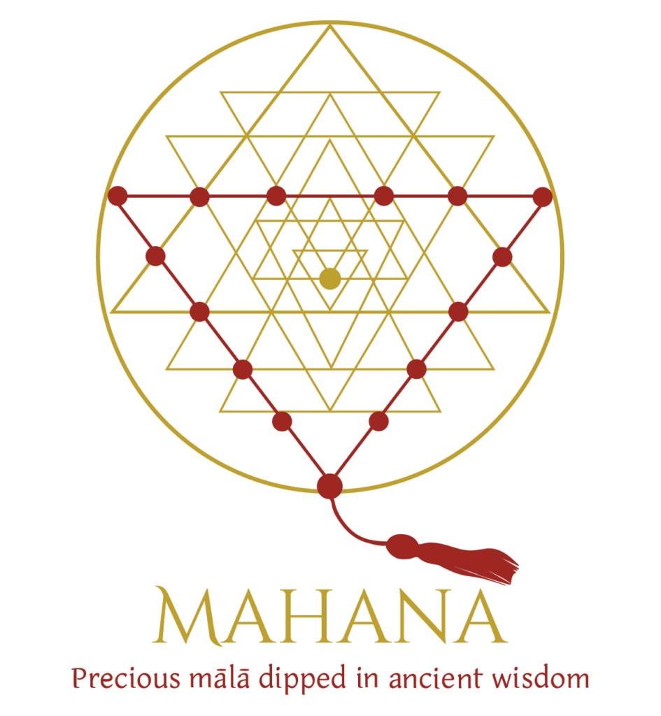
The holistic logo design for Mahana translates ancient spiritual symbolism into a refined visual identity. Inspired by the sacred geometry of the Sri Yantra, it reflects the brand’s essence: handcrafted mālās that unite beauty, devotion and ancient wisdom.

Brand: Mahana

Location: Hungary

Field: Handcrafted Gemstone Mālās & Spiritual Jewellery

Services: Logo Design

Mahana creates handcrafted mālās made from carefully selected gemstones and sacred seeds, offering meaningful companions for meditation, prayer and personal transformation. Each piece is created with intention, honouring traditional spiritual practices while bringing timeless craftsmanship into the present.

At the heart of the brand is the belief that a mālā is a sacred tool that supports mindfulness, inner connection and conscious living. Every design reflects a deep respect for ancient wisdom and the transformative journey it inspires.

My role was to translate this philosophy into a visual identity that feels both precious and timeless. 

Essence: What Mahana Stands For

Mahana creates handcrafted mālās made from carefully selected gemstones and sacred seeds, each one intended to accompany a personal spiritual journey. More than jewellery, these pieces become companions for meditation, prayer and inner transformation.

The identity draws from the timeless symbolism of the Sri Yantra, expressing divine feminine energy, devotion and ancient wisdom through a contemporary visual language. The result is a brand that feels precious, meaningful and deeply connected to its spiritual roots.

Mahana feels radiant, devotional and precious. It stands out as sacred, luminous, precious, timeless, embodying devotion and ancient wisdom.  All of these qualities have been reflected in the elegance of the final logo.
Design Direction: Grounded, Organic, Resonant

 On the energetic map, Mahana is:

Sacred. Precious. Timeless.

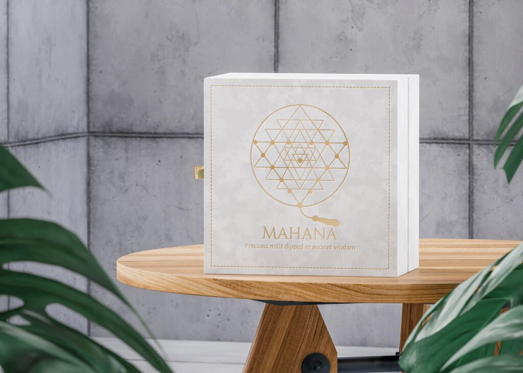
Every visual decision was guided by Mahana’s intention to create objects of lasting spiritual value. The identity balances ancient symbolism with refined simplicity, allowing the sacred geometry to remain the focal point while communicating elegance, craftsmanship and authenticity.

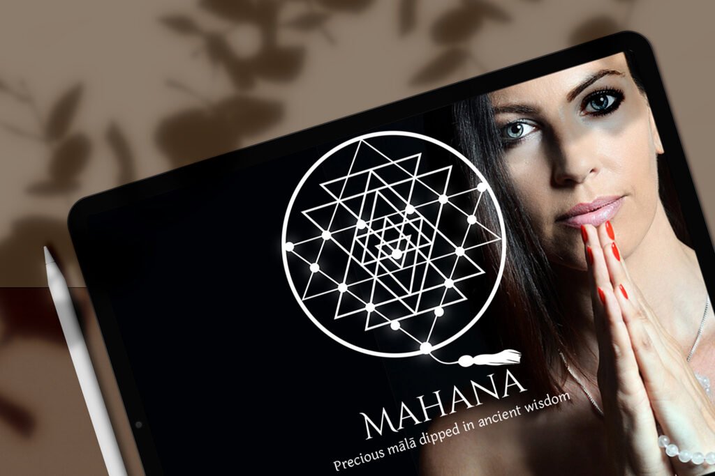
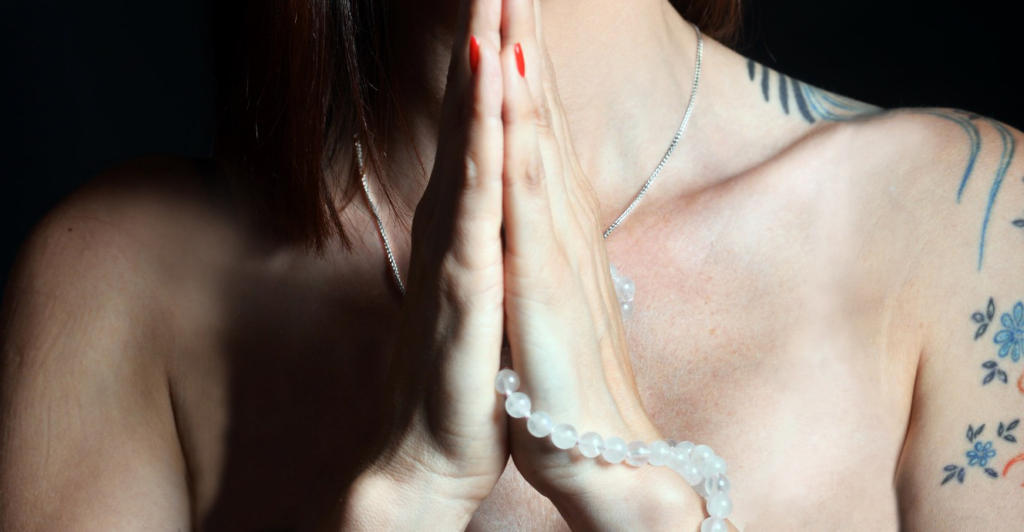
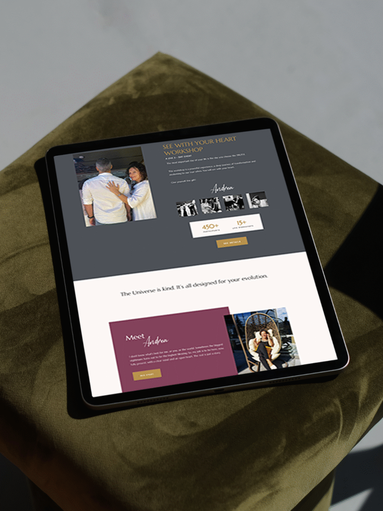
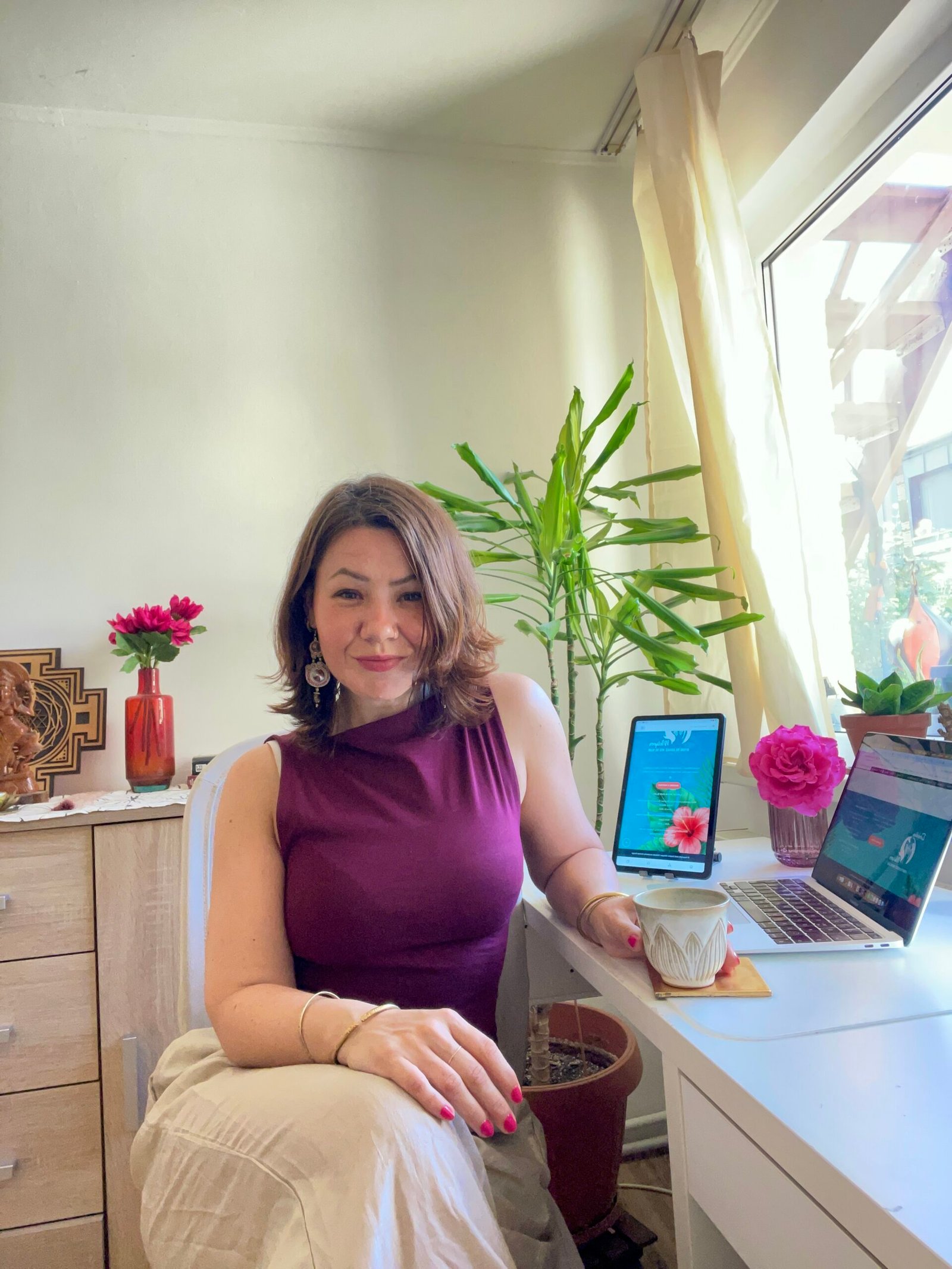
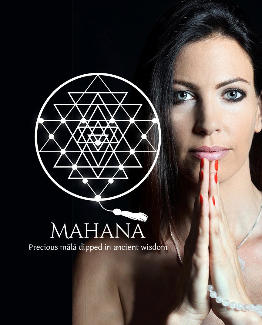
Mahana logo by Amritaé Design, featuring a sacred geometry Sri Yantra symbol representing divine balance and ancient wisdom, on which there is highlighted a mala. The logo is displayed on a digital tablet beside a serene portrait of the owner, Hana, in prayer.

Symbol Concept – Triangle+Sri Yantra+Mālā

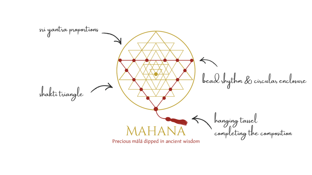
Rather than placing a mālā beside a sacred symbol, the logo transforms the Sri Yantra itself into a mālā.

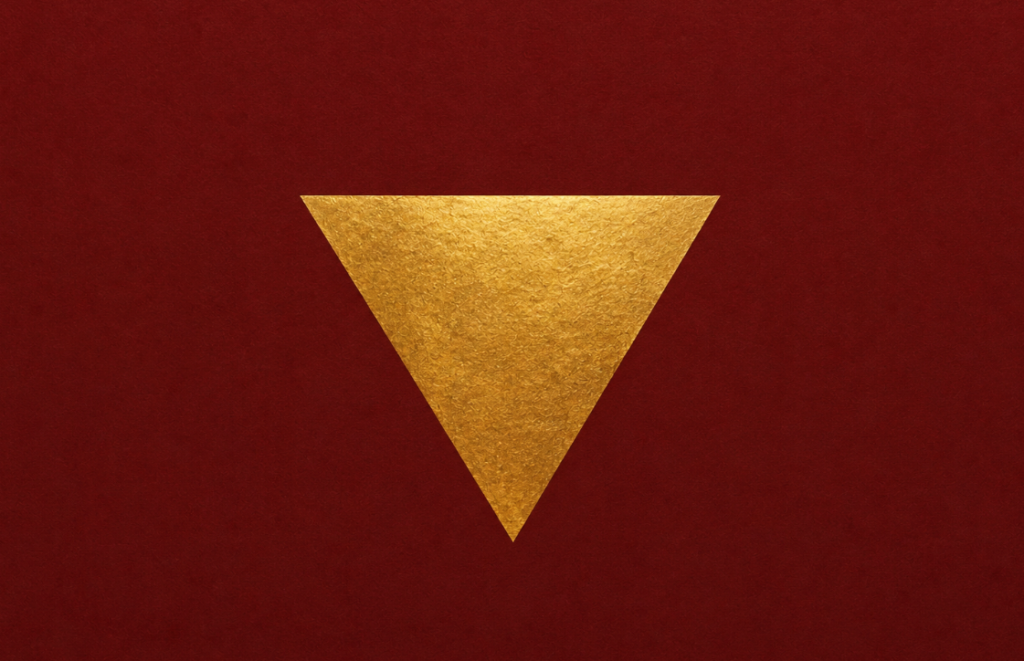
The beads follow the downward Shakti triangle, creating a visual metaphor where spiritual practice and sacred geometry become one. The pendant extends naturally from the final bead, completing the journey while introducing movement and humanity into an otherwise perfectly geometric composition.

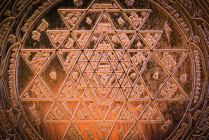
The Sri Yantra has long been revered as one of the most powerful symbols of divine feminine energy, abundance and spiritual awakening. By weaving the mālā into its structure, the logo reflects Mahana’s purpose: precious mālās immersed in ancient wisdom.

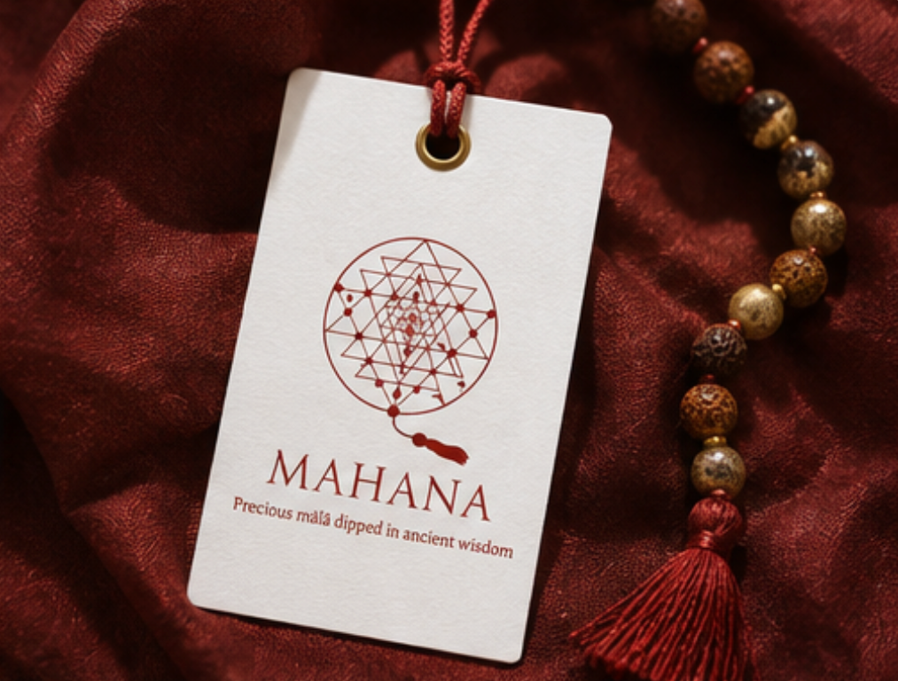
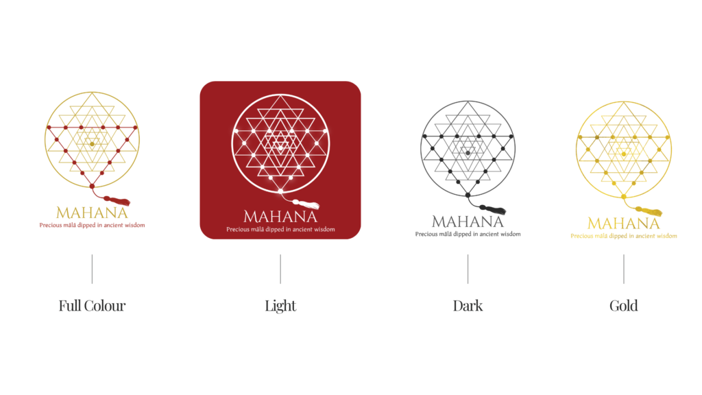
In lighter applications, a subtle radiant glow surrounds the mālā, suggesting the energetic presence traditionally associated with sacred objects. It reinforces the idea that each mālā carries both physical beauty and spiritual intention.

Logo Arhitecture

The Mahana holistic logo design is an overall synthesis of shakti, Sri Yantra sacred geometry and mālā shape.

Colour World – Intense & Sacred

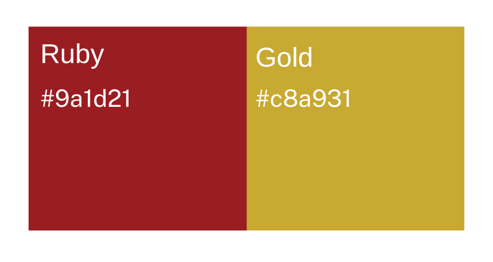
The colour palette reflects both material richness and spiritual symbolism.

Deep ruby red evokes devotion, vitality and the transformative fire of spiritual practice.

Warm gold represents wisdom, preciousness and the timeless value of sacred tradition.

Together they create a palette that feels luxurious without excess, honouring both craftsmanship and the spiritual heritage behind every mālā.

Typography – Elegance & Devotion

A refined serif typography was selected to express craftsmanship, heritage and quiet luxury. Its classical proportions complement the sacred geometry without competing for attention, allowing the symbol to remain the heart of the identity.

Spacious layouts and generous breathing room reinforce the feeling of calm, contemplation and timeless elegance.

.Primary Typeface: Cinzel Decorative — the font brings a sense of elegance and heritage.

Secondary Typeface: BBT — applied for tagline. Its Indian inspired and warm serif gives a spiritual mystical touch.

As a result, the combination of these fonts is timeless as well as authentic. 

Client Experience

“Yoli is an artist with wonderful energy. Working with my logo was a wonderful journey for me. This special journey, as Yoli led me through the process that she developed, brought me much closer to the brand I dreamed of. There were times when I really felt like this lovely Woman was reading my mind. I am very happy with the end result!! And I am so excited, I would like to post the whole world with my logo. It was a great experience! Thank you my Dear Yoli!”
Hana Kendi

How This Kind of Design Supports a Business

A considered holistic logo design and visual identity change how a business shows up every day.

What it gives the brand:

  • A recognizable face on: website, socials, documents, signage.

  • A coherent language of logo, color and type, so everything looks like it belongs to the same business.

  • Decision ease: no more guessing fonts, colours or styles for every new asset.

  • Higher perceived value: a brand that looks intentional supports better pricing and better clients.

  • Confidence for the founder: you know what your brand looks like, so you can focus on the work itself.

A proprietary process blending strategy, symbolism and essence mapping — shared in full with confirmed clients

How I build it

  • We start with the essence of the work: who you serve, what you stand for, and how you want people to feel.

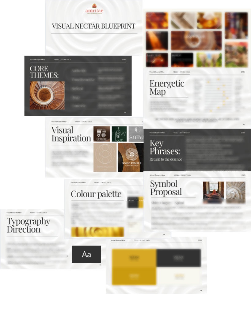
  • I create a visual blueprint that maps symbols, mood, typography and color into a structured system.

  • From there, I design the logo and core identity elements and test them in real contexts: website, social, print.

  • You receive a compact, usable identity kit you can actually work with: logo files, color codes, type system and key applications.

This is bespoke work, built to hold the depth of what you do and to be usable in real life, day after day.

Logo Design & Visual Identity · Web Design · Brand Mentorship

Your brand can be this aligned.
Translate Your Brand’s Essence Into Form

Founder

Yoli Amritaé

I’m Yoli, a brand identity designer and brand mentor focused on visual alignment.

I have 14+ years of design experience, plus studies and background in communication, PR and NGO management. That mix brings structure, strategy and precision into my work, alongside depth, creativity and originality.

In recent years, my work expanded beyond execution. I now combine design with 1:1 guidance that clarifies direction first, so your brand can reflect its true essence in a clear visual form.

“Yoli has a rare ability to truly understand your brand and translate it into visual language that feels both authentic and impactful.”
Shared by a valued, long-term client.

I work with conscious entrepreneurs, creatives, and founders who want their presence to feel true on the outside and aligned on the inside.

Get in touch if you want a brand that’s unmistakably yours.

Scroll to Top