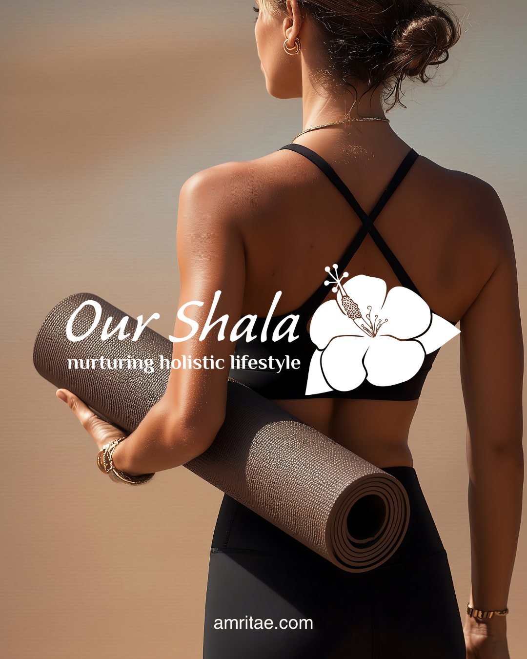
Our Shala Brand at a Glance

 YOGA LOGO DESIGN

Brand: Our Shala

Location: USA

Field: Yoga Platform

Services: Logo Design

Our Shala is a holistic platform that brings together yoga, meditation, and plant-based lifestyle practices. The project’s intention was to create a welcoming, calm, and judgment-free online space, a digital home where people can connect with nature’s rhythm and nurture a balanced, conscious way of living.

Catherine’s vision was to build a space that supports people in reconnecting to nature, simplicity, and balance. “Shala,” meaning home or house of practice, became the foundation for this concept: a virtual and physical home for people exploring conscious living.

My role was to design a meaningful logo that reflects this atmosphere of warmth, openness, and clarity. The goal was to express Our Shala’s holistic values, keeping the identity natural, soothing and easy to recognise.

Explore this project on Behance. If you enjoyed it, tap the like button to appreciate the project and help it reach more creatives.

Essence: What Our Shala Stands For

Our Shala represents a return to simplicity and balance. The brand’s message is that well-being should be natural, inclusive, and approachable, not exclusive or dogmatic.

It stands for:

  • A nurturing space where everyone can practice without judgment or comparison.

  • Connection to nature, reflected in its plant-based philosophy and sustainable mindset.

  • Practical spirituality, focused on daily habits and mindful presence.

  • Community and sharing, inviting collaboration and learning across disciplines.

The brand’s identity bridges tradition and modern wellness, offering yoga, meditation and nutrition guidance with the same intention: to help people return to their natural rhythm.

Design Direction: Nurturing, Feminine & Natural

 On the energetic map, Our Shala is:

Warm and balanced | Approachable and modern | Calm and natural | Structured yet flowing

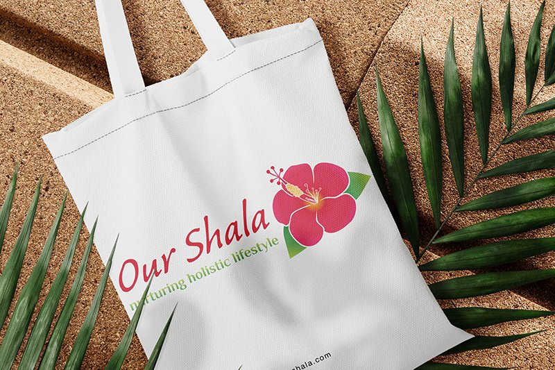
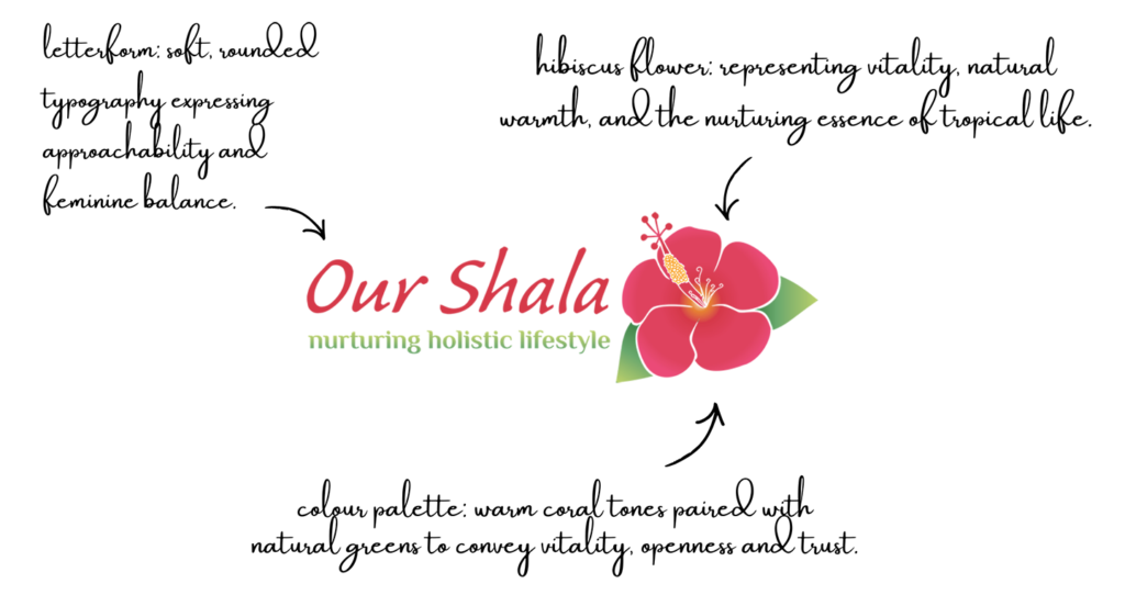
Catherine wanted a logo that looked natural, feminine and alive, something that people could immediately connect to emotionally. The goal was not to follow stereotypical yoga imagery, but to convey authenticity through a blossoming hibiscus flower.

 The final logo communicates blooming and openness, representing a yoga practice that integrates healing, joy and ease.

It was important that the logo felt optimistic and inclusive, while preserving a sense of refinement.

Symbol Concept – Hibiscus Flower

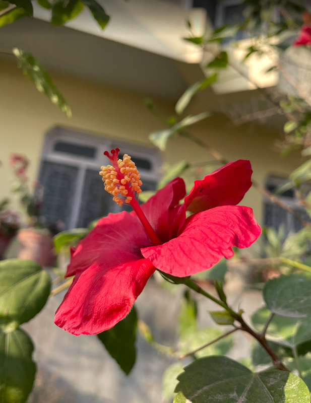
The Our Shala logo is built around the Hibiscus flower, a natural emblem of life, openness and tropical warmth. Chosen by Catherine as the core symbol, it represents the brand’s connection to nature, vitality and beauty in simplicity.

The design process focused on transforming the organic shape of the hibiscus into a clean, scalable mark that would remain instantly recognisable across formats. 

The hibiscus also reflects Our Shala’s approach to well-being: grounded, life-affirming and approachable.

It’s a symbol that expresses vitality, aligning with the brand’s mission to make yoga and holistic living practical, inclusive and authentic.


Logo Arhitecture

The architecture of Our Shala logo combines a floral mark and typographic softness to create a cohesive system that feels nurturing, approachable and instantly recognisable.

Colour World – Tropical & Nurturing

The colour palette is inspired by the tropical, natural atmosphere of Hawaii. The tones reflect both nature and vitality: the freshness of vegetation and the warmth of sunlight.

Coral Rose  #E65076    warm, welcoming, and expressive.

Hibiscus Red  #D33B4A    strong yet feminine, inspired by the flower’s natural vibrancy.

Leaf Green  #9EC3E    fresh, balanced and calming.

Tropical Green  #56985E    grounded, natural and connected to the organic world.

Typography – Feminine & Warm

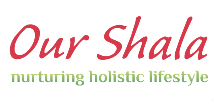
The Our Shala logo uses two complementary typefaces: Caliban STD for the main title and El Messiri Bold for the tagline.

The Caliban STD font has a handwritten flow with organic letterforms that add personality and warmth, aligning with the approachable, human tone of the brand.

El Messiri Bold provides a stable and modern counterpoint, with Indian influences.

Together, the two fonts create a system that feels balanced, natural and authentic.

Client Experience

"A beautiful thing about the rise of online offerings is getting to work with people from all over the world. It felt so aligned to connect with Yoli from India and have her create this beautiful logo for our yoga practice. Creating with Yoli felt natural. She listens, nurtures and loves what she does. She was accommodating and supportive through the great process and I’m so happy that it’s her energy behind this design. Truly a great and fluid experience!!  Thank you thank you thank you."
Catherine
Yoga Teacher & Founder Our Shala

How This Kind of Design Supports a Business

 A considered logo and visual identity change how a business shows up every day.

It’s not decoration. It’s structure.


What it gives the brand:

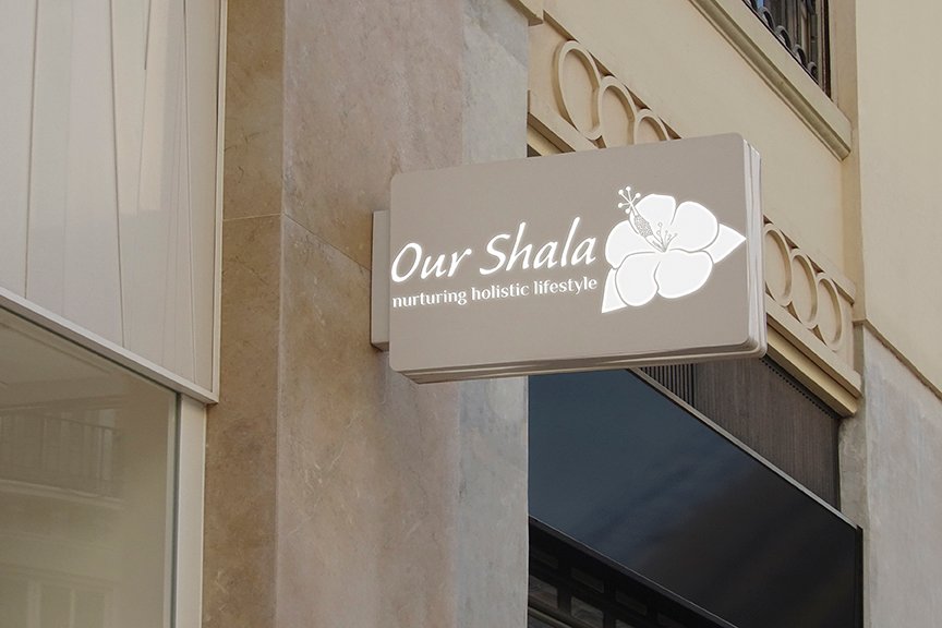
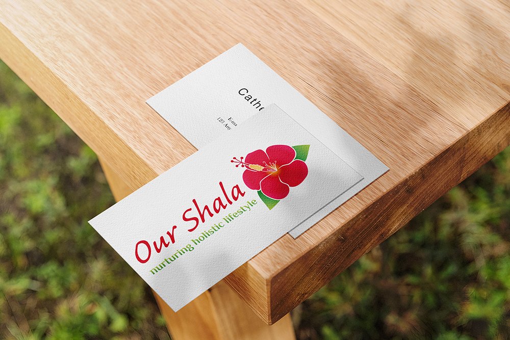
  • A recognizable face on: website, socials, documents, signage.

  • A coherent language of logo, color and type, so everything looks like it belongs to the same business.

  • Decision ease: no more guessing fonts, colours or styles for every new asset.

  • Higher perceived value: a brand that looks intentional supports better pricing and better clients.

  • Confidence for the founder: you know what your brand looks like, so you can focus on the work itself.

A proprietary process blending strategy, symbolism and essence mapping — shared in full with confirmed clients

How I build it

  • We start with the essence of the work: who you serve, what you stand for, and how you want people to feel.

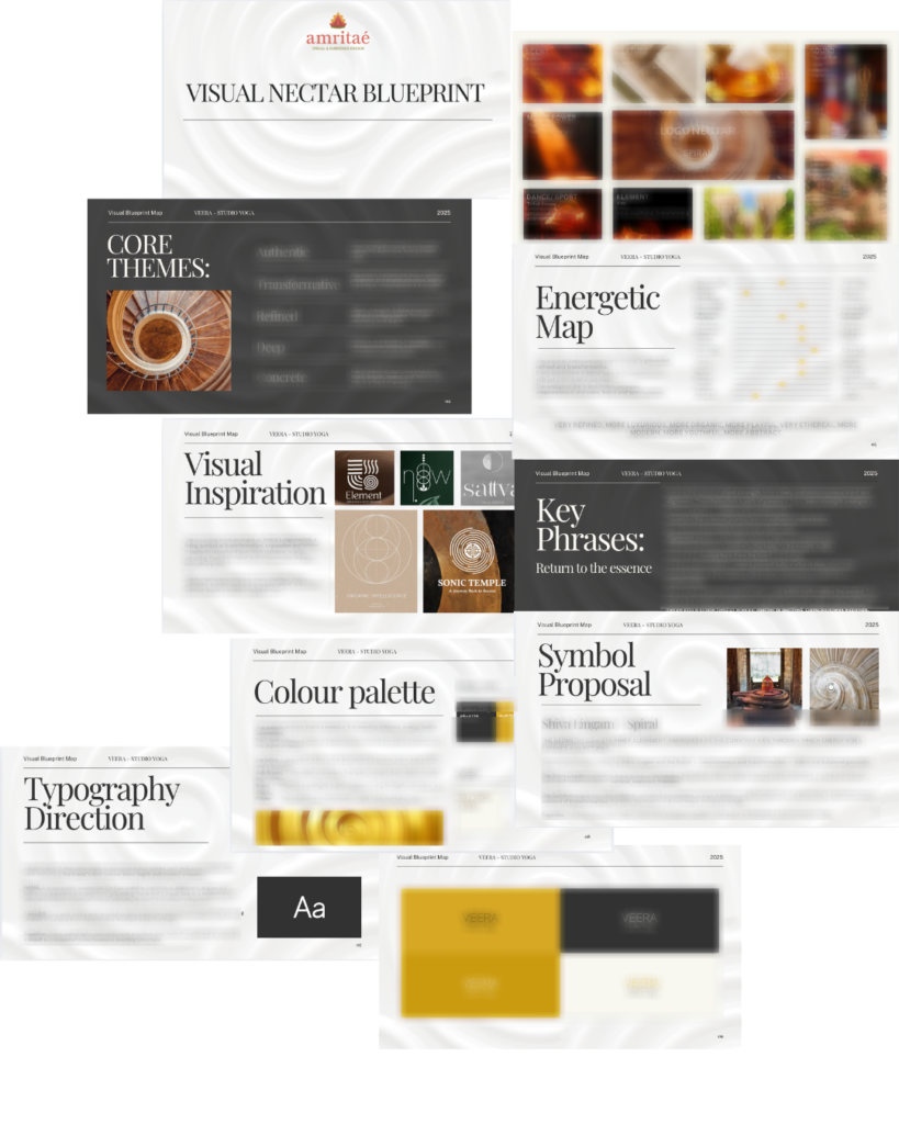
  • I create a visual blueprint that maps symbols, mood, typography and color into a structured system.

  • From there, I design the logo and core identity elements and test them in real contexts: website, social, print.

  • You receive a compact, usable identity kit you can actually work with: logo files, color codes, type system and key applications.

This is bespoke work, built to hold the depth of what you do and to be usable in real life, day after day.

Your brand can feel this aligned

Ready for your own logo design/complete visual identity?

If this project resonates and you want your own logo and visual identity made with the same depth, let’s build it together.

Yoli, founder of Amritaé Design, working at her desk with a laptop and digital pen in a softly lit studio space.

Founder

Yoli Amritae

I’m Yoli, a brand identity designer and brand mentor focused on visual alignment.

I have 14+ years of design experience, plus studies and background in communication, PR and NGO management. That mix brings structure, strategy and precision into my work, alongside depth, creativity and originality.

In recent years, my work expanded beyond execution. I now combine design with 1:1 guidance that clarifies direction first, so your brand can reflect its true essence in a clear visual form.

“Yoli has a rare ability to truly understand your brand and translate it into visual language that feels both authentic and impactful.”
Shared by a valued, long-term client.

I work with conscious entrepreneurs, creatives, and founders who want their presence to feel true on the outside and aligned on the inside.

Get in touch if you want a brand that’s unmistakably yours.

Scroll to Top