Prem Leela Records Brand at a Glance

 HOLISTIC LOGO DESIGN

Brand: Prem Leela Records

Location: Ireland

Field: Devotional Music Label & Spiritual Arts

Services: Logo Design

Tone: Joyful, heartfelt, playful, sacred

Core Idea: Translating divine love into musical expression: sound as prayer, play and devotion.

Prem Leela Records is a devotional music label dedicated to creating and sharing sacred sound.

Its vision is celebrating music as a living form of prayer, where devotion becomes play and sound becomes the language of divine love.

Essence: What Prem Leela Records Stands For


Prem Leela translates to “the divine play of love.”

So imagine a recording studio where every note, every beat and every vibration is a conscious journey that leads to Divine Love. This is the essence of Prem Leela Records.

Prem Leela Records represents the evolution of devotional music into a refined, contemporary experience. 

The project stands for authenticity, joy and creative devotion, transforming Bhakti into sound that feels accessible, alive and emotionally resonant.

Each element, from rhythm to visual identity, reflects the same intention: to make devotion not distant or ceremonial, but living, breathing and deeply human.

The Logo Design process has been an intentional and mindful co-creative process that mirrors the very essence of the studio’s purpose.

Design Direction: Refined, Conscious, Devotional

On the energetic map, Prem Leela Records is:

Joyful and playful | Devotional and modern | Harmonious and alive | Refined and heart-centred

Through thoughtful symbolism, a harmonious color palette and a dynamic design, the Logo expresses the transformative power of music in awakening the spirit, connecting the listener with a higher state of consciousness.

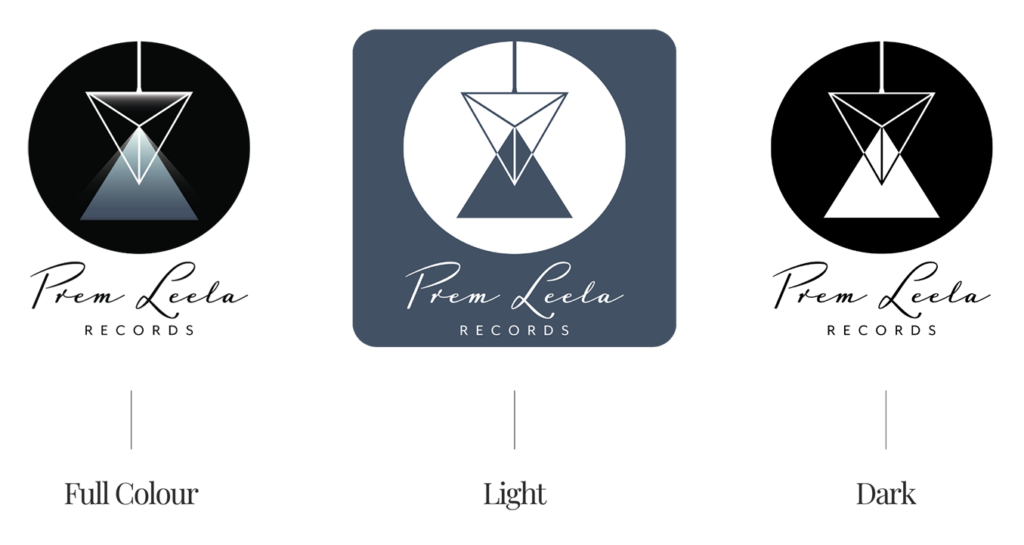
As colours are frequencies that evoke emotions and energies, I used tones of calming blues ground the design, with touches of ethereal white glows, symbolising the connection between the earthly and the divine.

Symbol Concept – Triangles + Prism + Light Refraction

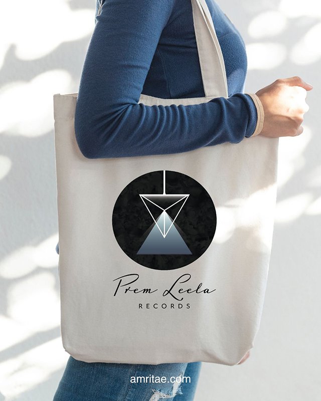
The symbol for Prem Leela Records unites geometry, light and devotion as movement and reflection.

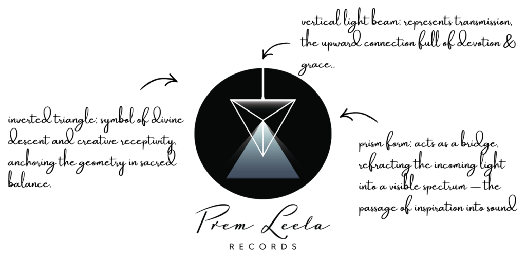
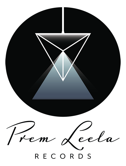
The Prem Leela Records logo is built around a minimalist prism structure, where geometry becomes a vessel for divine light.

At its core, the downward-pointing triangle represents receptivity, the sacred feminine principle and the descent of inspiration. The light that enters this triangle passes through the prism, refracting into a luminous beam that connects to the upper part, symbolising the divine grace that comes through in aligned creation, as light descends into form and rises back into source.

It represents music as a channel of divine connection, a bridge where sound becomes prayer and love becomes vibration.

Logo Arhitecture

Yhe architecture of the Prem Leela Records logo follows a vertical axis of illumination, a geometric structure translating the flow of light into form.

Colour World – Calm, Deep, Transcendent

The colour palette for Prem Leela Records captures the powerful essence of devotional music.

Each tone translates an emotional frequency, from the lightness of prayer to the depth of inner stillness.

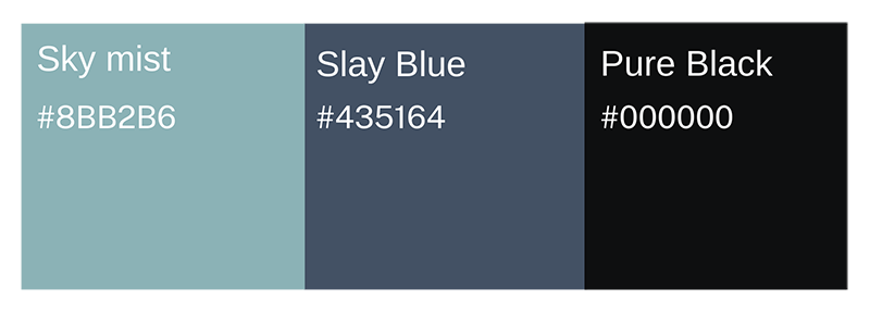
Colour Palette

Sky Mist (#8BB2B6) – symbolises purity, breath and devotion, a calm emotional landscape.

Slate Blue (#435164)  embodies depth, reflection and the contemplative tone of sacred sound.

Pure Black (#000000) – represents the mystery of creation, the infinite void from which light and music arise.

Together, these tones form a subtle field of calm, depth and transcendence.

Typography – Elegant, Fluid, Expressive

The typography system reflects the emotional depth and refined professionalism of Prem Leela Records.

It unites artistic devotion with clear communication, much like the brand’s purpose of translating divine feeling into sound.

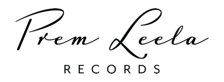
Prem Leela – set in Luxus Brut, a graceful handwritten typeface that conveys fluidity, sincerity and emotional movement. It embodies the artistic and heartfelt nature of devotional music.

Records — set in Mr Eaves Mod OT, a minimalist sans-serif with extended letter spacing for a refined, record-label aesthetic. The deliberate kerning gives space for sound and silence to coexist visually.

Together, they are intuitive yet composed, expressive yet refined.

Client Experience

It is an absolute joy and privilege to work with Yoli. Her love and devotion to her work shines through each and every project she is involved in. If you are looking for artwork that will truly represent you, then look no further than Amritae Design. Yoli works with heart full of love, kindness, patience and creativity. We feel very honoured and blessed to have worked with such an amazing being. Thank you Yoli.
Prem & Sangita
Prem Leela Records

How This Kind of Design Supports a Business

 A considered logo and visual identity change how a business shows up every day.

It’s not decoration. It’s structure.


What it gives the brand:

  • A recognizable face on: website, socials, documents, signage.

  • A coherent language of logo, color and type, so everything looks like it belongs to the same business.

  • Decision ease: no more guessing fonts, colours or styles for every new asset.

  • Higher perceived value: a brand that looks intentional supports better pricing and better clients.

  • Confidence for the founder: you know what your brand looks like, so you can focus on the work itself.

A proprietary process blending strategy, symbolism and essence mapping — shared in full with confirmed clients

How I build it

  • We start with the essence of the work: who you serve, what you stand for, and how you want people to feel.

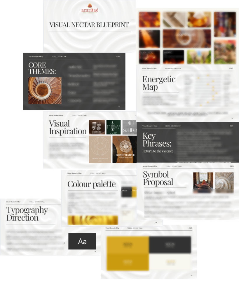
  • I create a visual blueprint that maps symbols, mood, typography and color into a structured system.

  • From there, I design the logo and core identity elements and test them in real contexts: website, social, print.

  • You receive a compact, usable identity kit you can actually work with: logo files, color codes, type system and key applications.

This is bespoke work, built to hold the depth of what you do and to be usable in real life, day after day.

Your brand can feel this aligned

Ready for your own logo design/complete visual identity?

If this project resonates and you want your own logo and visual identity made with the same depth, let’s build it together.

Yoli, founder of Amritaé Design, working at her desk with a laptop and digital pen in a softly lit studio space.

Founder

Yoli Amritae

I’m Yoli, a brand identity designer and brand mentor focused on visual alignment.

I have 14+ years of design experience, plus studies and background in communication, PR and NGO management. That mix brings structure, strategy and precision into my work, alongside depth, creativity and originality.

In recent years, my work expanded beyond execution. I now combine design with 1:1 guidance that clarifies direction first, so your brand can reflect its true essence in a clear visual form.

“Yoli has a rare ability to truly understand your brand and translate it into visual language that feels both authentic and impactful.”
Shared by a valued, long-term client.

I work with conscious entrepreneurs, creatives, and founders who want their presence to feel true on the outside and aligned on the inside.

Get in touch if you want a brand that’s unmistakably yours.

Scroll to Top