Raising Royalty Brand at a Glance

 HOLISTIC LOGO DESIGN

Brand: Raising Royalty

Location: USA

Field: Conscious Parenting

Services: Logo Design

Raising Royalty was a women-centered platform created to help mothers and daughters embody self-worth, consciousness and inner strength.

The founder envisioned a movement that uplifted women by nurturing confidence, balance and purpose through a modern, conscious lens.

Amritaé Design had the honour of creating a logo that captured both the empowerment and grace behind her vision, a design that bridges emotional depth with refined elegance.

Explore this project on Behance. If you enjoyed it, tap the like button to appreciate the project and help it reach more creatives.

Dedicated to beloved Sage Mira, whose vision continues to inspire.

What Raising Royalty Stood For

Raising Royalty stood for conscious parenting and generational healing, the understanding that the way we raise our children shapes the emotional landscape of the next generation.

It was created for parents walking a path of awareness, who believe that nurturing children begins with nurturing oneself. The brand encouraged families to raise children not from patterns of fear or expectation, but from presence, gratitude, and self-leadership.

The tagline “Creating Generational Blessings” expressed this mission: transforming inherited struggles into conscious growth and emotional freedom.

Design Direction: Refined, Feminine, Elevated

 On the energetic map, Raising Royalty was:

Nurturing and elevated | Grounded and conscious | Gentle and wise | Empowering and refined

he visual direction for Raising Royalty drew from the warmth and serenity of natural textures: soft sand, candlelight, ocean waves, and honeysuckle fragrance, each reflecting the qualities of comfort, growth, royal energy and transformation.

On the energetic map, the brand felt feminine, serene, and elevated, yet deeply grounded in authenticity.

The design language mirrored that balance:

Soft curves and refined geometry conveyed emotional safety with structural clarity.

Warm golden tones symbolised wisdom and legacy.

Gentle gradients evoked inner growth and expansion, like stepping into warm light after transformation.

The brand avoided ornamentation, relying instead on minimal, intentional forms that communicated clarity, self-awareness and devotion to growth,  the same values found in conscious parenting.

Symbol Concept: Mother + Child + Vertical Column of Light + Lotus

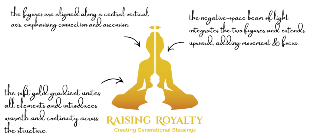
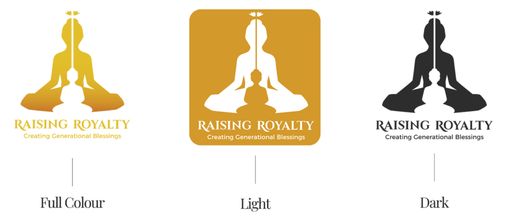
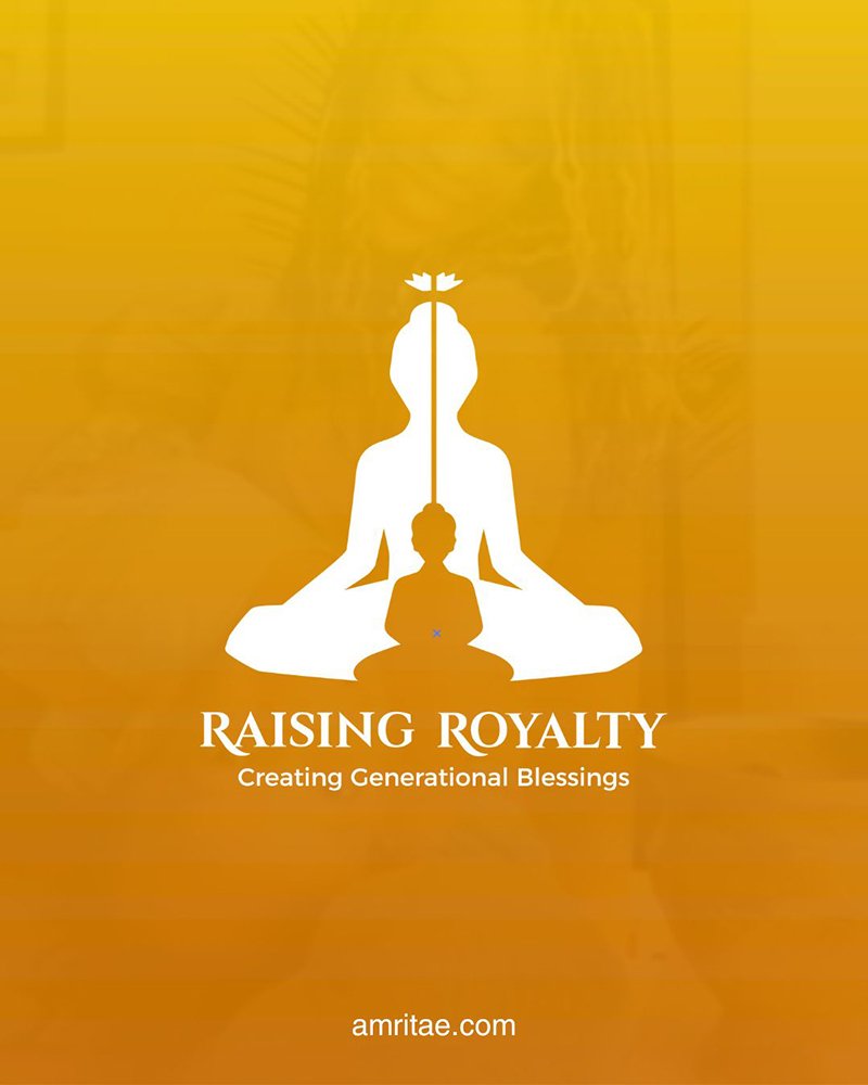
The Raising Royalty logo was built around a profound symbolic relationship: the mother and child as one form, sculpted through negative space.

The child emerged from the mother’s shape, expressing not separation but continuity: the idea that conscious parenting begins within the parent’s own awareness.

The child’s figure represents a healed, self-aware being: calm, open and centred.

The mother form, strong yet gentle, held presence without control: a grounded energy that nurtures growth while allowing freedom.

Through both figures flowed a vertical beam of light, symbolising the path of awareness that unites generations, the shared journey from instinct to consciousness.

Above them, a lotus completed the composition: the flowering of wisdom and the unfolding of higher understanding.

Together, these elements formed a timeless emblem of presence, growth and generational healing: the visual embodiment of “Creating Generational Blessings.”


Digital illustration created in honour of Sage Mira and her son Isa — a tribute to their love, strength and light that continue to inspire.

Logo Arhitecture

The architecture of the Raising Royalty logo is built around a vertical composition, where the mother and child forms create a balanced, upward flow.

The overall architecture expresses stability, harmony and elevation, ensuring the symbol remains strong and readable across all applications.

Colour World – Warm & Elegant

The colour system of Raising Royalty was designed to convey warmth, awareness, and elevation — tones that reflect conscious growth, emotional depth, and the light of new beginnings. The visual atmosphere feels nurturing, radiant and timeless.

Colour Palette

Golden Dawn (#E2BF2A): Represents illumination, awakening, and clarity — the essence of conscious parenting and generational awareness.

Honey Dew (#D3992A): Evokes warmth and nourishment, symbolising the sweetness of care and the natural rhythm of growth.

Earth Amber (#C87929): Brings grounding and continuity, anchoring the palette in the strength of lived experience and embodied wisdom.

Together, the palette embodies a journey from light to depth, forming a warm and balanced visual harmony.

Typography – Regal & Elegant

The typography of Raising Royalty balanced elegance with approachability.

The logo name was created in a refined, serif font that conveyed royalty, and timelessness, qualities that reflect the idea of raising consciousness with grace.

The tagline, set in a softer sans-serif style, was intentionally more open and friendly.

Together, they formed a visual hierarchy that communicates awareness, warmth, accessible yet regal.

Client Experience

“I’ve been trying to find the proper words to express my gratitude for your art. As a Marketing Director, I have been working with graphic designers for over 10 years, and Yoli is by far my favourite designer! The way she approaches projects and her collaborative nature is what is most impressive. Yoli is extremely intuitive and creative which made the design process a very intimate one. She is sure to take the time to get a clear understanding of what it is you want and she will help you develop your ideas. It is clear that she is passionate about her work, and, by extension, the success of her clients.”
Sage Mira
(in loving memory)

How This Kind of Design Supports a Business

 A considered logo and visual identity change how a business shows up every day.

It’s not decoration. It’s structure.


What it gives the brand:

  • A recognizable face on: website, socials, documents, signage.

  • A coherent language of logo, color and type, so everything looks like it belongs to the same business.

  • Decision ease: no more guessing fonts, colours or styles for every new asset.

  • Higher perceived value: a brand that looks intentional supports better pricing and better clients.

  • Confidence for the founder: you know what your brand looks like, so you can focus on the work itself.

A proprietary process blending strategy, symbolism and essence mapping — shared in full with confirmed clients

How I build it

  • We start with the essence of the work: who you serve, what you stand for, and how you want people to feel.

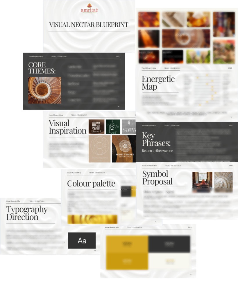
  • I create a visual blueprint that maps symbols, mood, typography and color into a structured system.

  • From there, I design the logo and core identity elements and test them in real contexts: website, social, print.

  • You receive a compact, usable identity kit you can actually work with: logo files, color codes, type system and key applications.

This is bespoke work, built to hold the depth of what you do and to be usable in real life, day after day.

Your brand can feel this aligned

Ready for your own logo design/complete visual identity?

If this project resonates and you want your own logo and visual identity made with the same depth, let’s build it together.

Yoli, founder of Amritaé Design, working at her desk with a laptop and digital pen in a softly lit studio space.

Founder

Yoli Amritae

I’m Yoli, a brand identity designer and brand mentor focused on visual alignment.

I have 14+ years of design experience, plus studies and background in communication, PR and NGO management. That mix brings structure, strategy and precision into my work, alongside depth, creativity and originality.

In recent years, my work expanded beyond execution. I now combine design with 1:1 guidance that clarifies direction first, so your brand can reflect its true essence in a clear visual form.

“Yoli has a rare ability to truly understand your brand and translate it into visual language that feels both authentic and impactful.”
Shared by a valued, long-term client.

I work with conscious entrepreneurs, creatives, and founders who want their presence to feel true on the outside and aligned on the inside.

Get in touch if you want a brand that’s unmistakably yours.

Scroll to Top