RAMANAM Brand at a Glance

 HOLISTIC LOGO & Web DESIGN

Brand: RAMANAM – The Center for Inner Transformation

Location: Turkey

Field: Conscious Living, Inner Transformation

Services: Logo Design & Website Design

Ramanam – The Online Center for Inner Transformation is a digital platform that brings together practitioners from various healing disciplines to support personal growth and spiritual evolution. The center’s vision is rooted in the belief that every human being has the potential to live a more happy, harmonious, peaceful, and conscious life.

Ramanam serves as a bridge between seekers and teachers, creating an accessible online space where individuals can connect with experienced practitioners for therapy, meditation and body-mind awareness.

The platform encourages inner alignment and reconnection with the essence of being, offering guidance for transformation at every level of self.

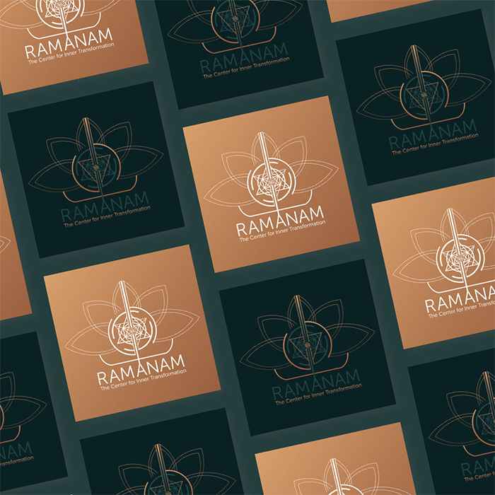
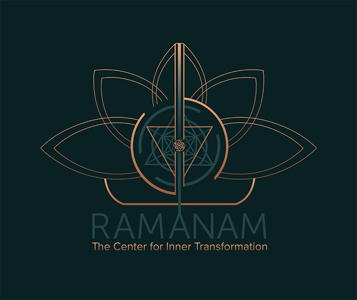
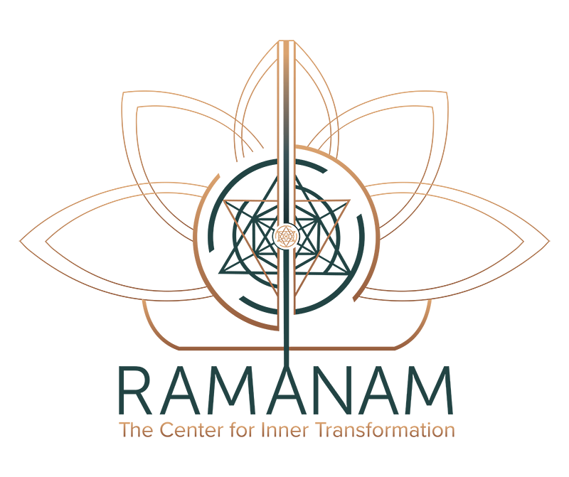
Ramanam logo design by Amritaé Design, featuring activated sacred geometry and lotus-inspired lines with incense smoke in the background, representing the Center for Inner Transformation.

Essence: What RAMANAM Stands For

Ramanam – The Center for Inner Transformation – is a conscious platform that connects individuals with practitioners and teachings dedicated to personal and spiritual growth.

Its foundation lies in the understanding that transformation begins within — through awareness, connection, and the courage to meet oneself fully.

By bringing together diverse healing modalities, Ramanam serves as a collective space where people can explore therapy, meditation, and energy work under one integrative vision. The project embodies clarity, structure and warmth, inviting both depth and accessibility in how inner transformation is experienced online.

Design Direction: Grounded, Organic, Refined

The logo design and website were designed to translate Ramanam’s essence into a clear and refined form.


The color palette combines copper and deep teal, symbolising transformation and stability, while the typography expresses both structure and trust.

Every design choice reflects the center’s dual purpose: creating a digital space that feels both sacred and professional.

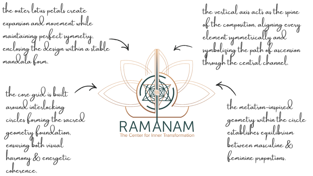
Logo Symbol Concept – Circles+Central Geometry+Lotus

This logo has so much precious meaning behind each intentional pixel. Sacred geometry, yogic & shamanic ancient wisdom, a hidden map of the road to Self that some are chosen to embark on in this lifetime.

The logo represents active transformation and energetic alignment.

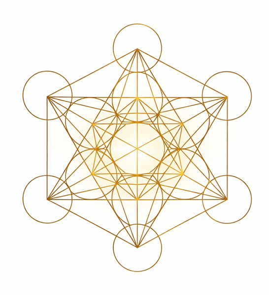
The circles generate active, transformative power, activating the sacred geometry inside. This represents transformation on all layers, down to the nucleus.

The vertical central line (Shushumna, Ida, Pingala) anchors the form, uniting grounding and divine connection.

The central geometry symbolizes expansion from the nucleus, a visual metaphor for growth through awareness.

The central axis grounds itself into the RAMANAM font, that acts like roots, from which the lotus blooms behind. 

Together, these elements aa become a direct reflection of Ramanam’s purpose, guiding inner transformation through conscious design and energy.

Logo Arhitecture

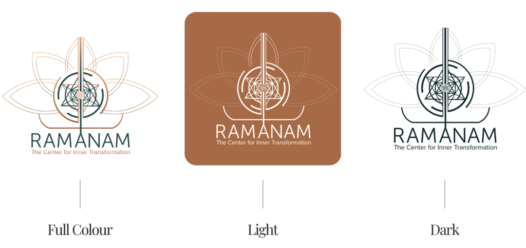
This architecture allows the logo to remain powerful at any scale, while preserving the sacred balance between mathematical precision and intuitive flow.

Colour World – Conscious & Transformative

The Ramanam color palette combines depth and warmth to reflect both the inner grounding and transformative expansion that define the brand. The contrast between teal and copper tones mirrors the essence of conscious transformation.

Colour Palette

Deep Teal (#0A2124) – is a mystical colour that symbolises grounding and stability. Serves as the visual anchor of the identity.

Teal (#234446) – adds a sense of balance and calm. Reflects inner growth and the flow of transformation.

Copper (#AB744D) – brings warmth, integrity and structure. Embodies the human aspect of transformation.

Light Copper (#C78E60) – provides contrast and luminosity. Suggests refinement and expansion..


Typography – Timeless & Modern

The Ramanam typography system is a combination of Museo Sans and Proxima Nova, two timeless and modern sans-serif fonts, letting the logo symbol stand out. 

Museo Sans – used for the brand name, is contemporary, giving the brand a grounded yet elevated aesthetic, suitable for both digital and print applications.

Proxima Nova – was used for tagline, bringing warmth through shape and colour. Its rounded proportions create visual softness, complementing Museo Sans.

Together, these fonts create a balanced typographic hierarchy.

RAMANAM Website Design

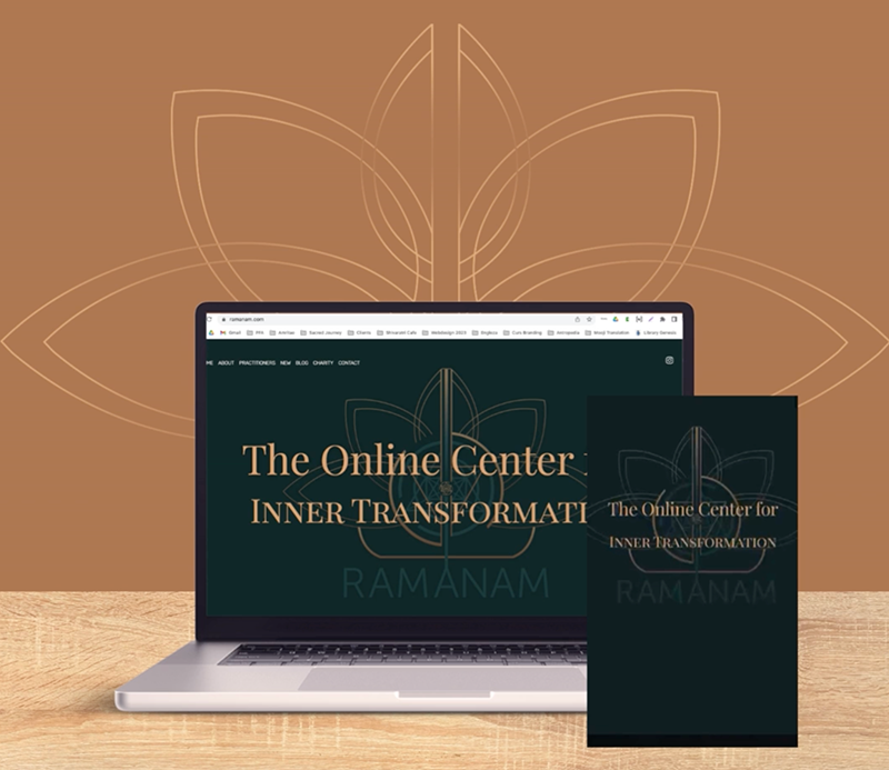
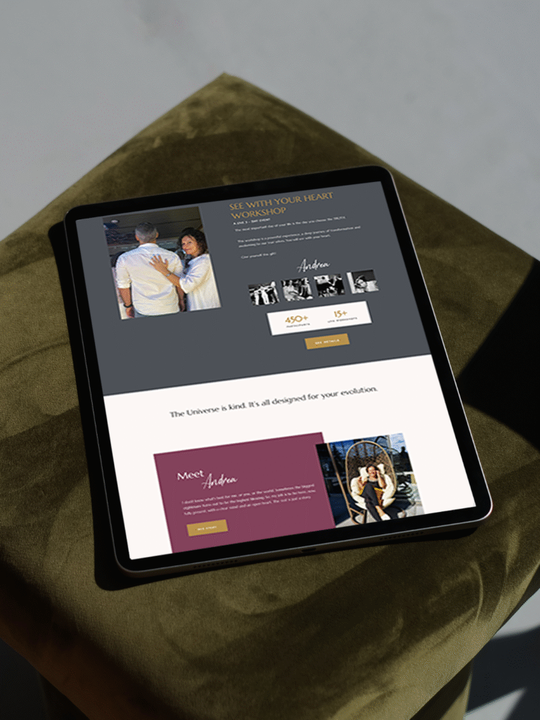
The Ramanam website was developed in WordPress, designed to function as an online sanctuary that reflects the center’s purpose of inner transformation. The website translated the brand’s philosophy into a cohesive digital experience.

The layout combines structured simplicity with warm, grounding tones from the brand palette, deep teal and copper. Typography, geometry and spacing were carefully aligned to mirror the brand’s emphasis on presence and balance.

Originally, the site also integrated a booking system and individual practitioner profiles, allowing visitors to explore and connect with facilitators directly.

Optimized for all devices, the responsive interface offers a smooth navigation flow, maintaining consistency between desktop and mobile. The final result is a professional and also full of grace website.

Client Experience

Some people are born to do the work they are doing. If you work with Yoli you get to know this. Just a genius. She is the most amazing designer I have ever worked with and met. The way she is creating a logo is very unique and special and I felt from the beginning that I was looking for exactly this but have never dreamed of to find it in someone. The way she is dedicated, how she is involving you into the whole process and how flexible she is to exact your needs is more than amazing. I think I am one of the difficult customers she had as I wanted the Logo more than perfect and she was able to exactly realize what I wanted. The most thing what amazed me was that the process of this logo making was a transformation in itself. This is what I wanted that the logo transmits. Deep gratitude to your work Yoli. It is not easy to find someone like you.
Ramanam logo design by Amritaé Design, featuring activated sacred geometry and lotus-inspired lines with incense smoke in the background, representing the Center for Inner Transformation.
Satyam
Ramanam Center

How This Kind of Design Supports a Business

A considered holistic logo design and visual identity change how a business shows up every day.

What it gives the brand:

  • A recognizable face on: website, socials, documents, signage.

  • A coherent language of logo, color and type, so everything looks like it belongs to the same business.

  • Decision ease: no more guessing fonts, colours or styles for every new asset.

  • Higher perceived value: a brand that looks intentional supports better pricing and better clients.

  • Confidence for the founder: you know what your brand looks like, so you can focus on the work itself.

A proprietary process blending strategy, symbolism and essence mapping — shared in full with confirmed clients

How I build it

  • We start with the essence of the work: who you serve, what you stand for, and how you want people to feel.

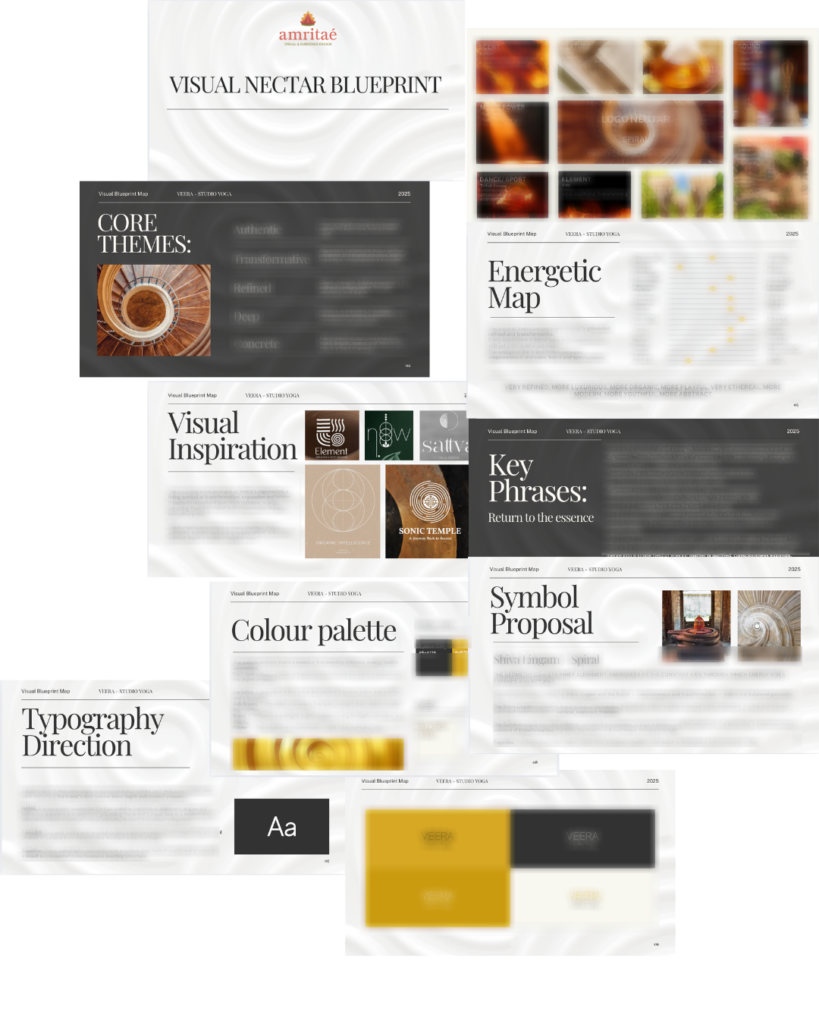
  • I create a visual blueprint that maps symbols, mood, typography and color into a structured system.

  • From there, I design the logo and core identity elements and test them in real contexts: website, social, print.

  • You receive a compact, usable identity kit you can actually work with: logo files, color codes, type system and key applications.

This is bespoke work, built to hold the depth of what you do and to be usable in real life, day after day.

Your brand can feel this aligned

Ready for your own logo design/complete visual identity?

If this project resonates and you want your own holistic logo design and visual identity made with the same depth, let’s build it together.

Yoli, founder of Amritaé Design, working at her desk with a laptop and digital pen in a softly lit studio space.

Founder

Yoli Amritae

I’m Yoli, a brand identity designer and brand mentor focused on visual alignment.

I have 14+ years of design experience, plus studies and background in communication, PR and NGO management. That mix brings structure, strategy and precision into my work, alongside depth, creativity and originality.

In recent years, my work expanded beyond execution. I now combine design with 1:1 guidance that clarifies direction first, so your brand can reflect its true essence in a clear visual form.

“Yoli has a rare ability to truly understand your brand and translate it into visual language that feels both authentic and impactful.”
Shared by a valued, long-term client.

I work with conscious entrepreneurs, creatives, and founders who want their presence to feel true on the outside and aligned on the inside.

Get in touch if you want a brand that’s unmistakably yours.

Scroll to Top