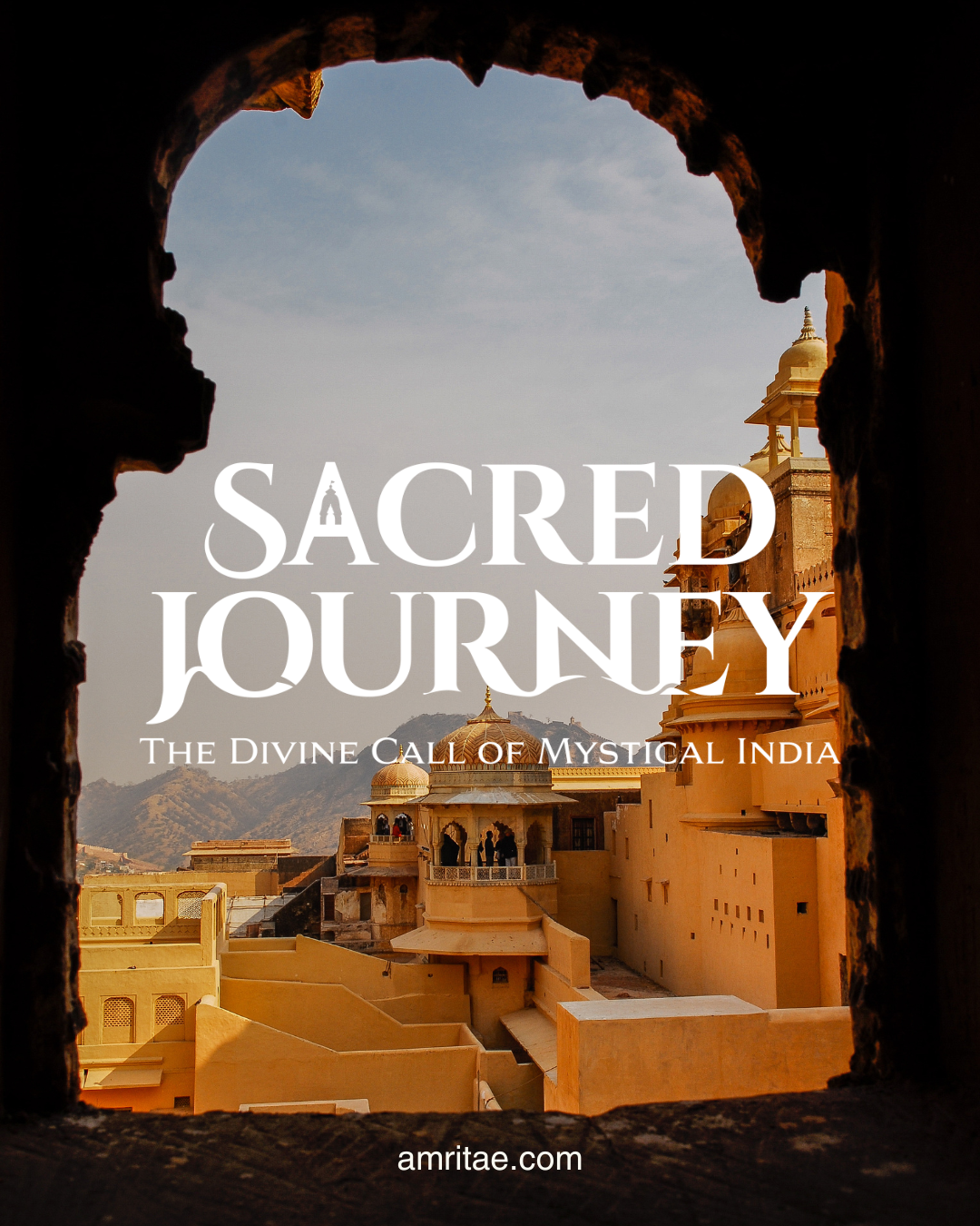
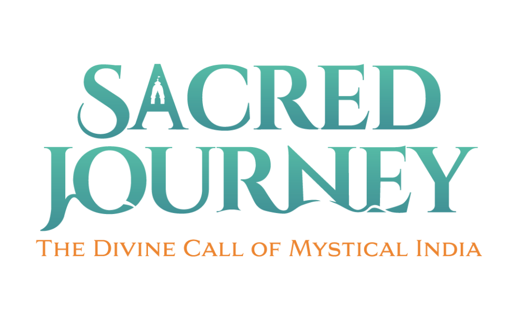
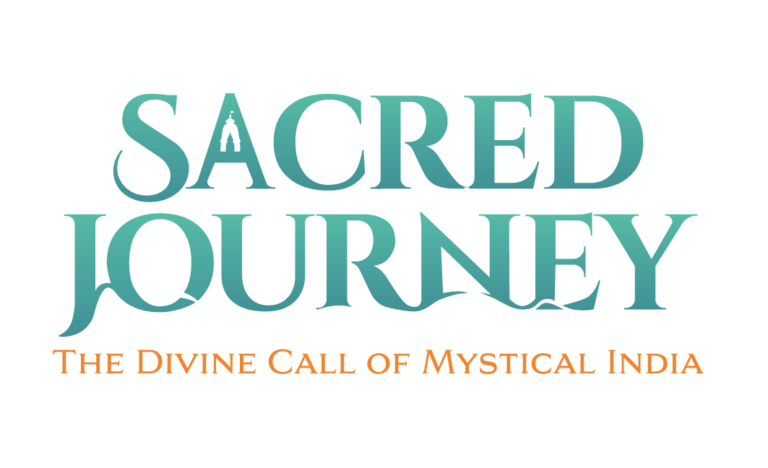
The holistic logo design for Sacred Journey translates India’s sacred landscape into a symbolic visual identity. It reflects the brand’s essence: spiritual pilgrimage, timeless wisdom and inner transformation.
Brand: Sacred Journey
Location: Romania & India
Field: Spiritual Journeys & Retreats
Services: Logo Design
Sacred Journey was created to guide seekers through some of India’s most sacred destinations, offering immersive experiences rooted in authentic spiritual traditions. Rather than focusing on tourism, each journey invited participants to connect with ancient wisdom through temples, meditation, yoga and encounters with respected teachers and living traditions.
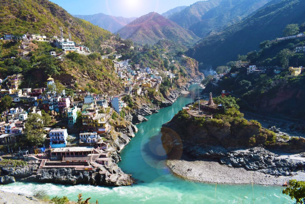
From the banks of the Ganga in Rishikesh to the monasteries of Dharamshala and the sacred cities of Northern India, every pilgrimage was designed to inspire inner transformation while honouring the rich spiritual heritage of the land.
My role was to translate this vision into a logo that feels timeless, sacred and deeply connected to India itself. The result is a logo that carries multiple layers of symbolism while remaining elegant and memorable.
Sacred Journey was created for travellers that want to experience India as a living spiritual tradition, where every place, practice and encounter became part of an inner journey.
The project celebrates devotion, discovery and transformation, encouraging participants to slow down, listen deeply and reconnect with the wisdom preserved within India’s sacred landscapes.
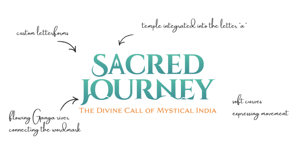
Rather than illustrating a spiritual journey, the identity embeds it within the typography itself. The flowing letterforms, integrated temple silhouette and subtle references to the Ganga work together to create a logo that reveals new layers of meaning over time. This approach transforms the identity from a simple wordmark into a visual story that reflects both the physical pilgrimage across India and the inner journey of transformation.
Through the primary typography the sacred Ganga River moves by using negative space.
Within the first letter A, there is a temple silhouette also made with negative space, honouring the sacred places encountered throughout the pilgrimage.
Rather than illustrating India literally, these elements become visual metaphors that invite closer discovery while preserving the elegance of the identity.
Together, the river and temple express both the outer journey across India and the inner journey toward deeper self-understanding.
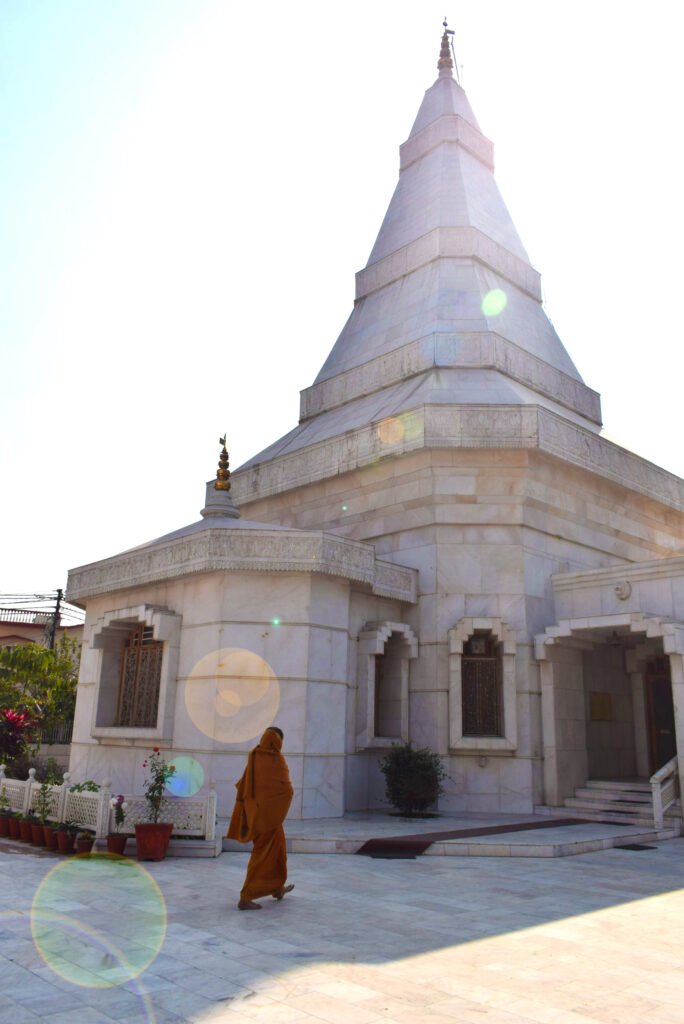
Photo Credit @amritaedesign
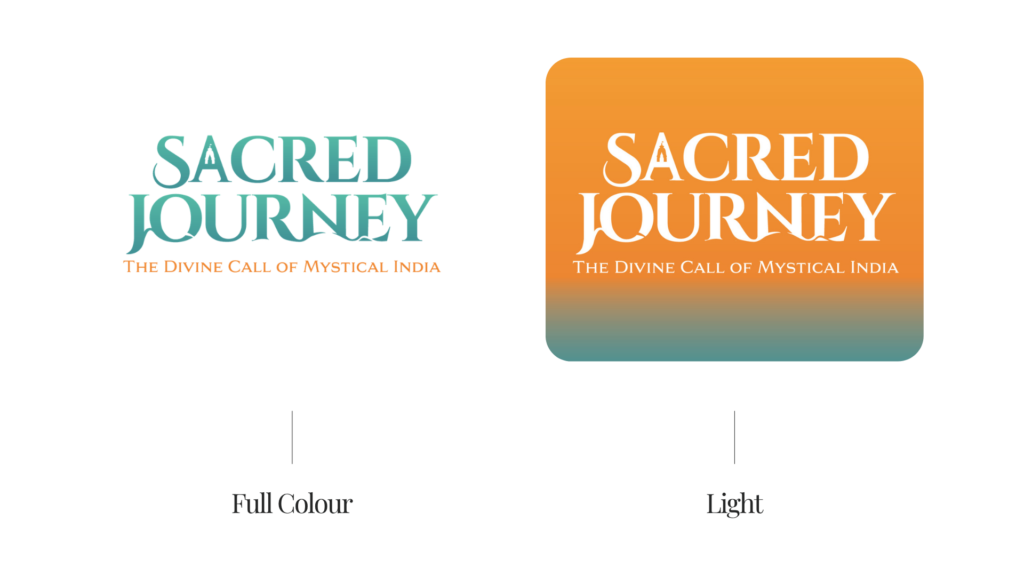
The logo combines expressive typography with carefully integrated symbolic details.
The flowing letterforms create a natural sense of movement, while the temple becomes an intrinsic part of the composition rather than an added illustration. Every element works together to create a balanced identity that remains distinctive at every scale.
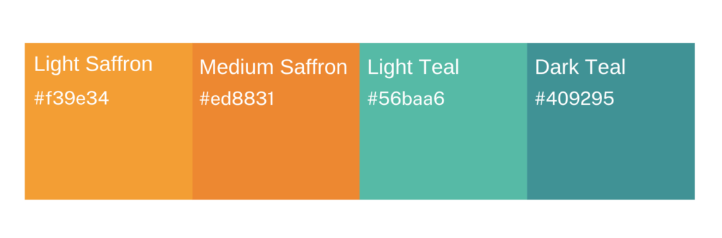
The palette reflects two defining elements of the journey: the turquoise waters of the sacred Ganga River and the warm saffron-orange tones associated with Indian saddhus, temples and spiritual devotion.
The soft gradients show movement and fluidity.
The typography was custom refined by using negative space to express movement, fluidity and elegance.
The flowing letterforms communicate the idea of pilgrimage.
Primary font: Cinzel Bold
Secondary font: Aviano Serif
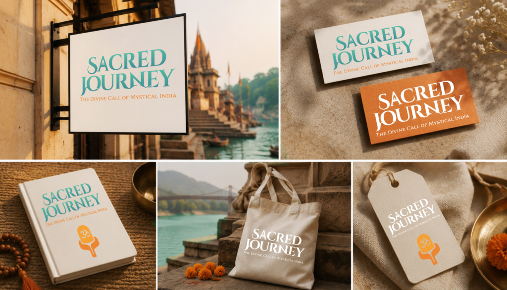
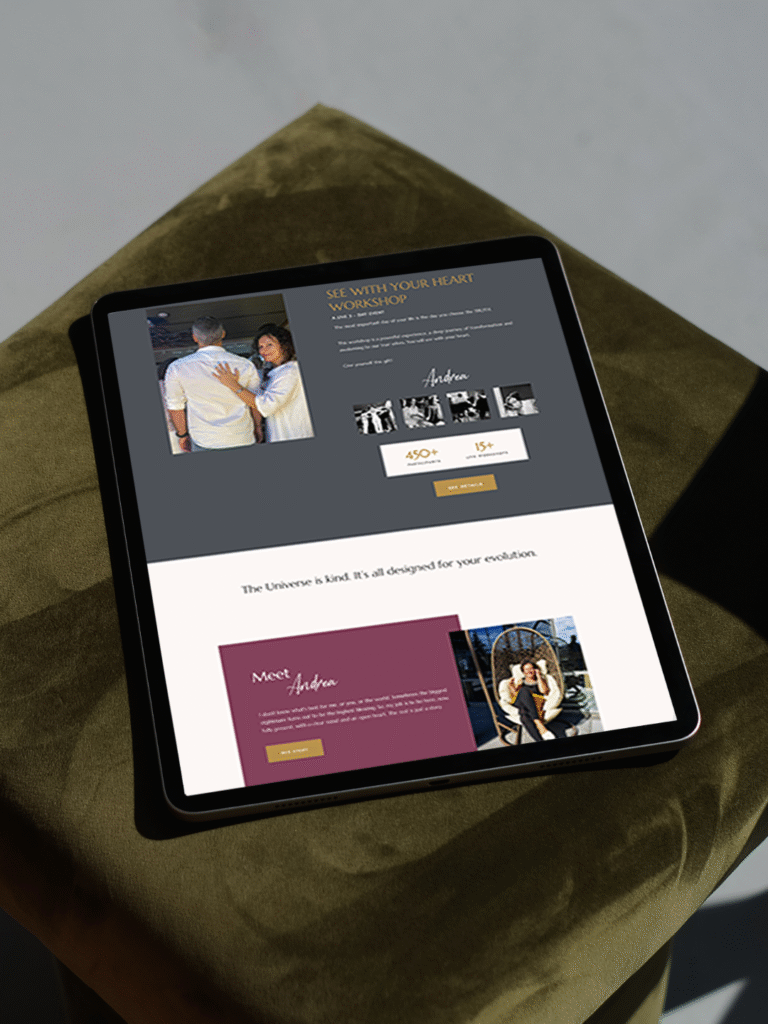
A considered holistic logo design and visual identity change how a business shows up every day.
What it gives the brand:
A recognizable face on: website, socials, documents, signage.
A coherent language of logo, color and type, so everything looks like it belongs to the same business.
Decision ease: no more guessing fonts, colours or styles for every new asset.
Higher perceived value: a brand that looks intentional supports better pricing and better clients.
Confidence for the founder: you know what your brand looks like, so you can focus on the work itself.
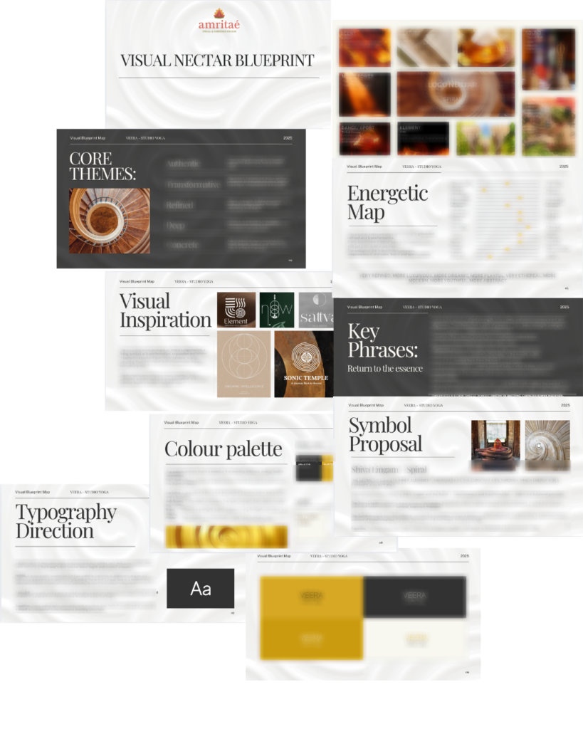
A proprietary process blending strategy, symbolism and essence mapping — shared in full with confirmed clients
We start with the essence of the work: who you serve, what you stand for, and how you want people to feel.
I create a visual blueprint that maps symbols, mood, typography and color into a structured system.
From there, I design the logo and core identity elements and test them in real contexts: website, social, print.
You receive a compact, usable identity kit you can actually work with: logo files, color codes, type system and key applications.
This is bespoke work, built to hold the depth of what you do and to be usable in real life, day after day.
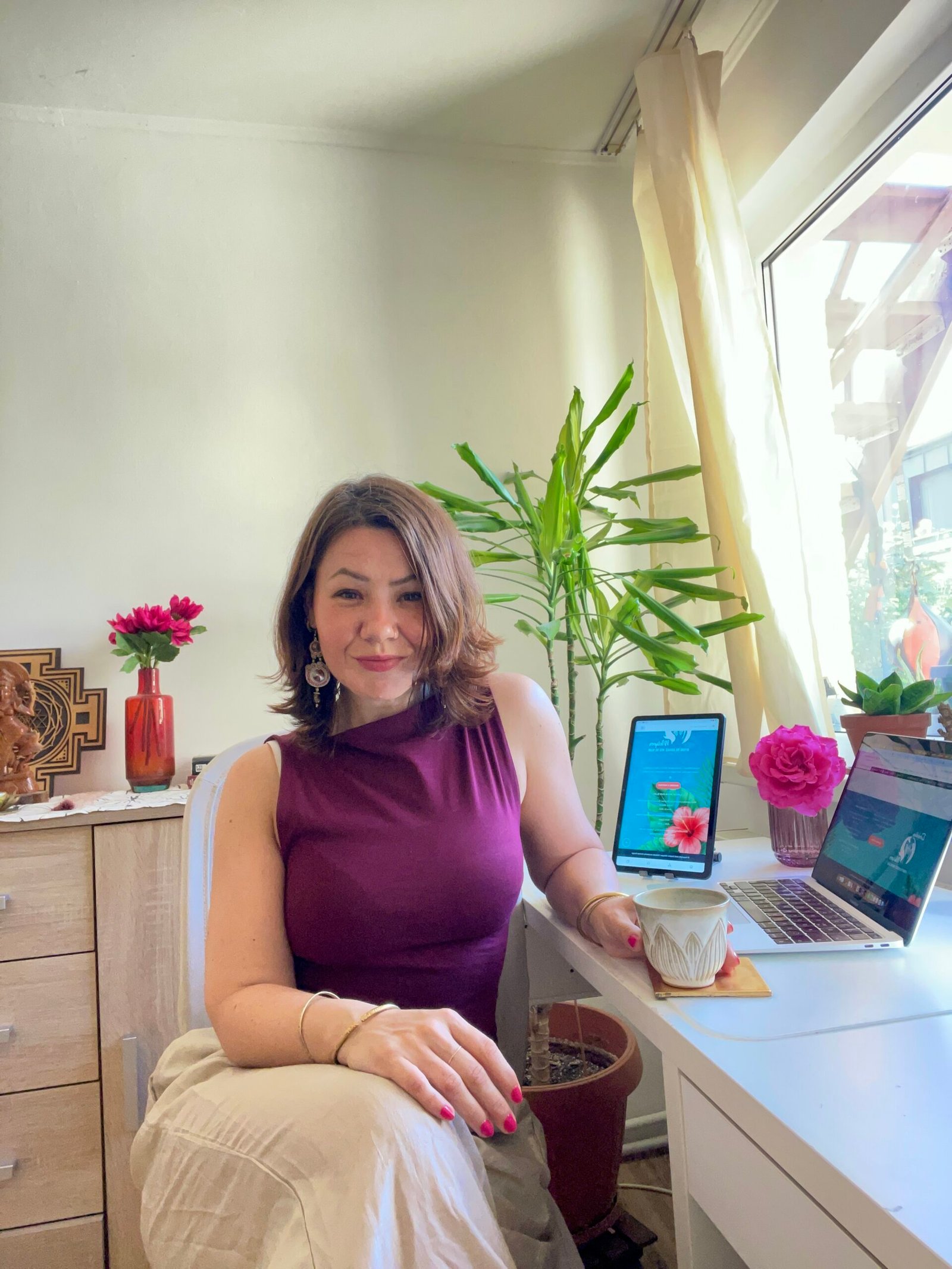
I’m Yoli, a brand identity designer and brand mentor focused on visual alignment.
I have 14+ years of design experience, plus studies and background in communication, PR and NGO management. That mix brings structure, strategy and precision into my work, alongside depth, creativity and originality.
In recent years, my work expanded beyond execution. I now combine design with 1:1 guidance that clarifies direction first, so your brand can reflect its true essence in a clear visual form.
“Yoli has a rare ability to truly understand your brand and translate it into visual language that feels both authentic and impactful.”
Shared by a valued, long-term client.
I work with conscious entrepreneurs, creatives, and founders who want their presence to feel true on the outside and aligned on the inside.
Get in touch if you want a brand that’s unmistakably yours.