Satvic Yoga Brand at a Glance

 YOGA LOGO DESIGN

The Satvic Yoga logo design embodies purity, balance and transformation, translating yogic philosophy into visual identity.

Brand: Satvic Yoga

Location: Saudi Arabia

Field: Yoga studio

Services: Yoga Logo Design

Satvic Yoga is a yoga school centred in the classical teachings of awareness and inner transformation. Its name, derived from the Sanskrit word satva, reffers to purity and harmony – qualities cultivated through a steady and mindful practice.

My role was to design a yoga logo design that could capture this essence in a simple, memorable form, one that would feel both sacred and contemporary. The goal was to translate the philosophy of yoga into a visual mark that communicates serenity, alignment and depth, without relying on clichés or ornamental symbolism.

The process focused on refining geometry, proportion and colour to show the state of equilibrium that defines the sattvic path. The result is a balanced, luminous symbol that mirrors the gifts cultivated through yoga.

Explore this project on Behance. If you enjoyed it, tap the like button to appreciate the project and help it reach more creatives.

Essence: What Satvic Yoga Stands For

Sattvic Yoga embodies the meeting point between discipline and surrender. The practice invites both structure and flow, cultivating awareness that is calm, awake and deeply centred.

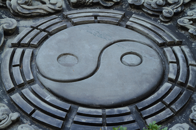
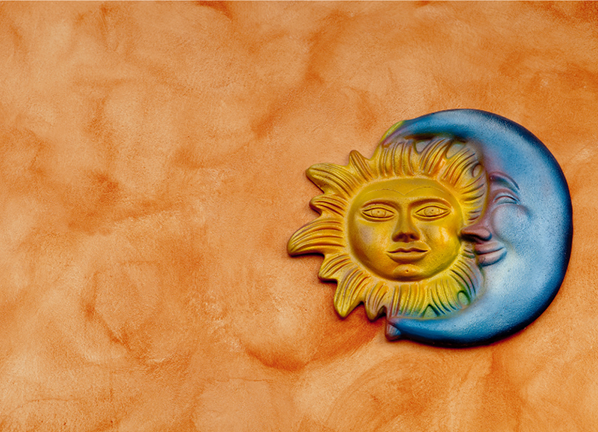
In the visual language, this translates into balance and contrast: yin yang, the radiant warmth of the sun meeting the cool serenity of water.

The symbol represents this union: masculine and feminine, strength and receptivity, action and stillness.

Each line and proportion was designed to convey stability and grace, qualities that reflect the inner transformation that yoga awakens. 

Design Direction: Balanced, Grounded, Harmonious

 On the energetic map, Satvic Yoga is:

Calm and centred  |  Balanced and radiant  |  Disciplined and flowing  |  Refined and sincere


The visual direction was guided by the sattvic principle itself. The goal was to create a symbol that evokes peace and focus, not ornamentation.

Visually, the client already knew that the symbol should be a yin yang with sun/moon elements.

That inspired the system to be built from: balanced duality, pure forms and contrasts of light/dark that show how duality exists through opposites, that together complement each other and in that wholeness merge into stillness.

Symbol Concept – Yin Yang + Sun/Moon

The Sattvic Yoga logo design draws inspiration from the eternal dance of the Sun and the Moon, representing the harmony between opposing yet complementary forces, the essence of the yin–yang principle.

The Sun embodies vitality, warmth and transformation, the masculine energy that ignites discipline and action. It symbolises the inner fire that sustains growth and awakening.

The Moon, in deep blue, represents stillness, intuition, and reflection, the feminine energy that brings calm, softness and renewal.

Together, these elements form a balanced whole, expressing the pure state of sattva.

The circular geometry of the logo mirrors wholeness and continuity, while the custom letterforms has Indian influence, grounding the design in authenticity. 

Logo Arhitecture

The architecture keeps the symbol abstract and modern, with a clear inner force.

Colour World – Warmth & Depth

The colour palette is built around the dual energy of the brand.

Marigold Orange represents vitality, focus and transformation, a reference to the fire element and the active masculine principle.

Deep Blue conveys calm, reflection and depth, as the water element and the receptive feminine principle.

Together, these tones establish a visual balance supporting the brand’s focus on harmony and inner alignment.

Typography – Indian Influences

The custom made typography combines subtle Indian-inspired characteristics with a clean, contemporary structure. The letterforms are balanced and refined, designed for clarity and readability while maintaining a distinctive character.

It is integrating cultural authenticity with modern functionality and traditional aesthetics.

Client Experience

"I am very pleased that we got in contact with Yoli. She caught our attention because she was both a yoga practitioner and a graphic designer, which is perfect!We were looking for someone who can create a logo for our studio who is able to share our vision for what we want. As it is a big challenge to find someone from where we are at to understand our mission. So we reached to Yoli and she was very professional and was able to ask us questions from important angles to round our idea for her. She was also patient to listen to our feedbacks and revising the logo and idea. I am happy that she was able to hear us with an open heart which makes communication really easy. The final result was astonishing! My heart beats were racing before opening the final design and I was amazed! I would absolutely highly recommend working with her."
Nada
Satvic Yoga

How This Kind of Design Supports a Business

 A considered logo and visual identity change how a business shows up every day.

It’s not decoration. It’s structure.


What it gives the brand:

  • A recognizable face on: website, socials, documents, signage.

  • A coherent language of logo, color and type, so everything looks like it belongs to the same business.

  • Decision ease: no more guessing fonts, colours or styles for every new asset.

  • Higher perceived value: a brand that looks intentional supports better pricing and better clients.

  • Confidence for the founder: you know what your brand looks like, so you can focus on the work itself.

A proprietary process blending strategy, symbolism and essence mapping — shared in full with confirmed clients

How I build it

  • We start with the essence of the work: who you serve, what you stand for, and how you want people to feel.

  • I create a visual blueprint that maps symbols, mood, typography and color into a structured system.

  • From there, I design the logo and core identity elements and test them in real contexts: website, social, print.

  • You receive a compact, usable identity kit you can actually work with: logo files, color codes, type system and key applications.

This is bespoke work, built to hold the depth of what you do and to be usable in real life, day after day.

Your brand can feel this aligned

Ready for your own logo design/complete visual identity?

If this project resonates and you want your own logo and visual identity made with the same depth, let’s build it together.

Yoli, founder of Amritaé Design, working at her desk with a laptop and digital pen in a softly lit studio space.

Founder

Yoli Amritae

I’m Yoli, a brand identity designer and brand mentor focused on visual alignment.

I have 14+ years of design experience, plus studies and background in communication, PR and NGO management. That mix brings structure, strategy and precision into my work, alongside depth, creativity and originality.

In recent years, my work expanded beyond execution. I now combine design with 1:1 guidance that clarifies direction first, so your brand can reflect its true essence in a clear visual form.

“Yoli has a rare ability to truly understand your brand and translate it into visual language that feels both authentic and impactful.”
Shared by a valued, long-term client.

I work with conscious entrepreneurs, creatives, and founders who want their presence to feel true on the outside and aligned on the inside.

Get in touch if you want a brand that’s unmistakably yours.

Scroll to Top