Sonic Temple Holistic Logo Design

Sonic Temple Brand at a Glance

 HOLISTIC LOGO DESIGN

The holistic logo design for Sonic Temple translates the power of sound into form. It reflects the brand’s essence: sound as vibration, and transformation.

Brand: Sonic Temple

Location: Ireland

Field: Sound Healing, Music & Conscious Arts

Services: Logo design

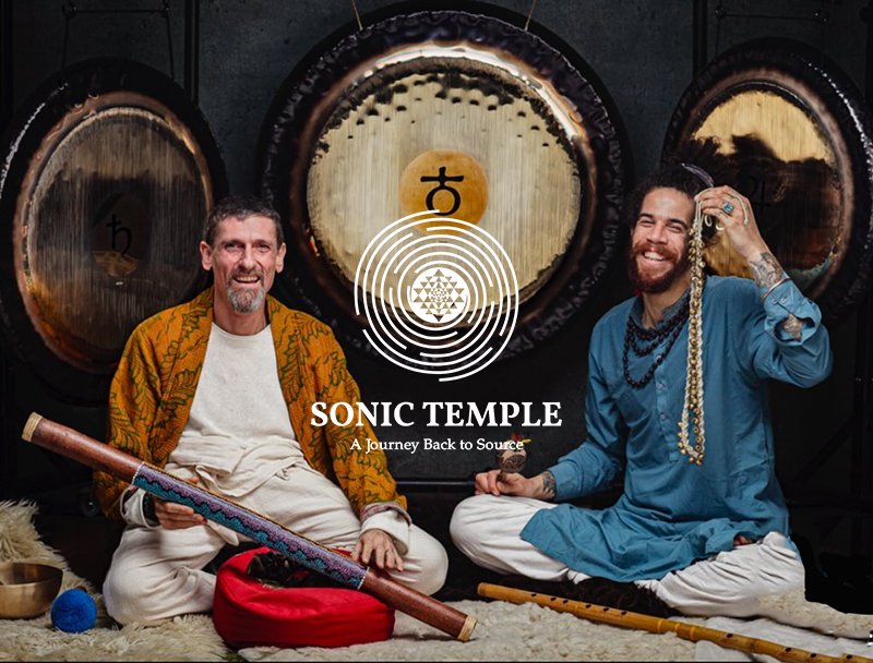
Sonic Temple music inspires the seekers to find their own inner healer and to unlock their own creative energy, to experiment a touch with Source.

Through music events, sound healing and guided meditative experiences, it invites people to travel within and, as a result, to reconnect with their own creative energy.

Overall, the music of Sonic Temple is to travel inward and connect with the Source. It  is used as a therapeutic tool to inspire seekers to and also to unlock their creative energy, guiding them toward their true selves.

My role for Sonic Temple logo design was to translate this philosophy into a visual identity that feels grounded and alive, to translate sound vibration into form.

Explore this project on Behance. If you enjoyed it, tap the like button to appreciate the project and help it reach more creatives.

Essence: What Sonic Temple Stands For

Sonic Temple brand is built on the understanding that sound is not only an art or practice but a structural force, therefore capable of reconnecting individuals to their own center and creative intelligence.

A journey inward through sound and silence: Each vibration becomes a tool for introspection and awareness, helping the listener return to inner stillness.

Awakening and transformation through resonance: The project uses frequency and rhythm to create change at both an emotional and energetic level, guiding participants toward a more integrated state of being.

Connection to Source and creative energy: Sonic Temple views music as a pathway back to the origin of inspiration, to that innate intelligence that animates life and creativity itself.

Authenticity, depth and presence: The holistic logo design and sound philosophy share the same principle: to be authentic and of service.

Design Direction: Grounded, Organic, Resonant

 On the energetic map, Sonic Temple is:

Earthy and authentic | Deep and resonant | Feminine and intuitive | Confident and alive

Sonic Temple holistic logo design brings together sound and matter, thus visualizing vibration as movement, rhythm and expansion.

The system is built from natural textures, elemental shapes and resonance, expressing the raw power of sound that heals from within.

sonic temple logo design

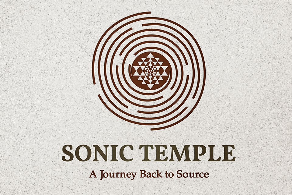
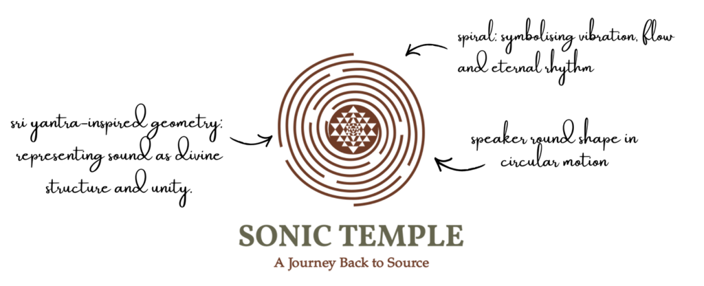
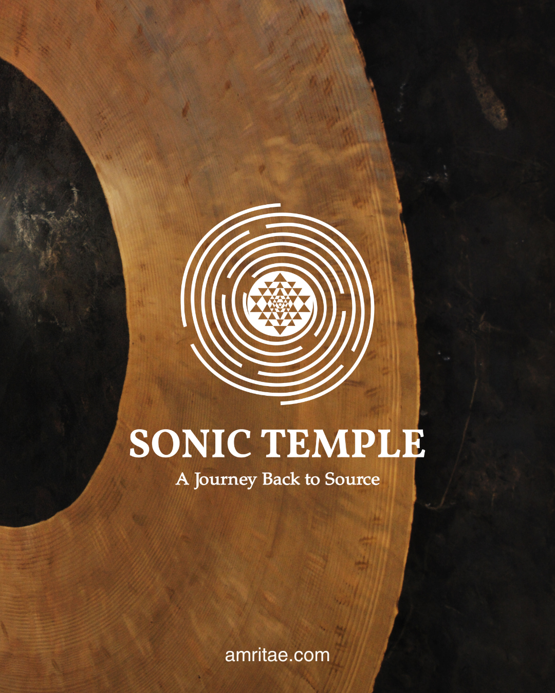
Symbol Concept – Spiral+Sri Yantra+Speaker

The sound has been always since the beginning of time.

The Sonic Temple holistic logo design merges three symbolic layers into a unified mark:

The Spiral represents sound in motion: the organic expansion of vibration, growth, and evolution.

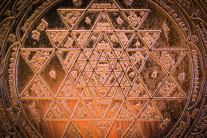
Sri Yantra in the center as the visual form and the divine manifestation of the sacred sound AUM – the sound that in Hinduism and Buddhism is the symbol of the source of creation.

The Speaker round form introduces a modern dimension to the symbol. It reminds us that sound is not abstract, it’s energy made tangible through vibration, space and technology.

Overall, the resulting design is both ancient and contemporary. In addition, it positions Sonic Temple as a brand that honours the origins of sound while also shaping new experiences for the present moment.

Logo Arhitecture

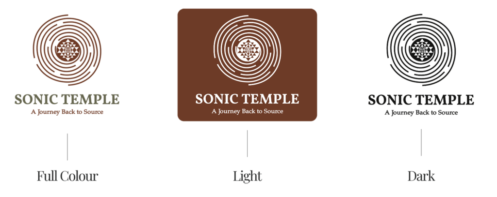
The Sonic Temple holistic logo design is an overall synthesis of spiral, sacred geometry and speaker form, to express sound as vibration and structure.

Colour World – Earthy & Grounding

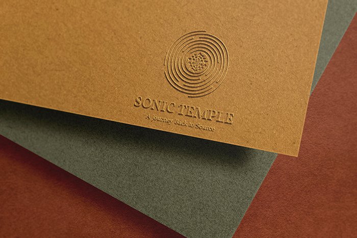
The visual system for Sonic Temple holistic logo design is inspired from the natural world, therefore grounding modern design in organic tones. Each colour and type choice was selected to evoke the sensorial and emotional quality of the brand’s core: sound as transformation.

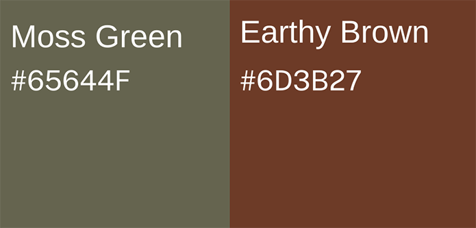
Colour Palette

Moss Green (#65644F): Symbolises the living connection to nature. It reflects the grounded quality of the brand.

Earthy Brown (#6D3B27): Represents soil and warmth, the physical and emotional foundation that gives life to resonance. 

Therefore, together, the colour palette is fully connected to the innate knowing of nature. 

sonic temple holistic logo design

Typography – Stability & Flow

sonic temple holistic logo design typography

The typographic structure balances stability and also movement, as the grounded yet flowing essence of Sonic Temple.

Primary Typeface: Volkorn Bold — the font brings a sense of strength, heritage and permanence while maintaining warmth.

Secondary Typeface: Portland LDO — applied for tagline. Its Indian inspired serif gives a spiritual mystical touch.

As a result, the combination of these fonts is timeless as well as authentic. 

Client Experience

Yoli's approach was very refreshing for us. She deeply connected to our project and her enthusiasm facilitated the creation of a logo that we are extremely happy with. We would definitely recommend Yoli to anyone that is looking for artwork that reflects one's core passion and soul desires. We are really excited about the journey ahead. Much love & Gratitude
Sonic Temple

How This Kind of Design Supports a Business

A considered holistic logo design and visual identity change how a business shows up every day.

What it gives the brand:

  • A recognizable face on: website, socials, documents, signage.

  • A coherent language of logo, color and type, so everything looks like it belongs to the same business.

  • Decision ease: no more guessing fonts, colours or styles for every new asset.

  • Higher perceived value: a brand that looks intentional supports better pricing and better clients.

  • Confidence for the founder: you know what your brand looks like, so you can focus on the work itself.

A proprietary process blending strategy, symbolism and essence mapping — shared in full with confirmed clients

How I build it

  • We start with the essence of the work: who you serve, what you stand for, and how you want people to feel.

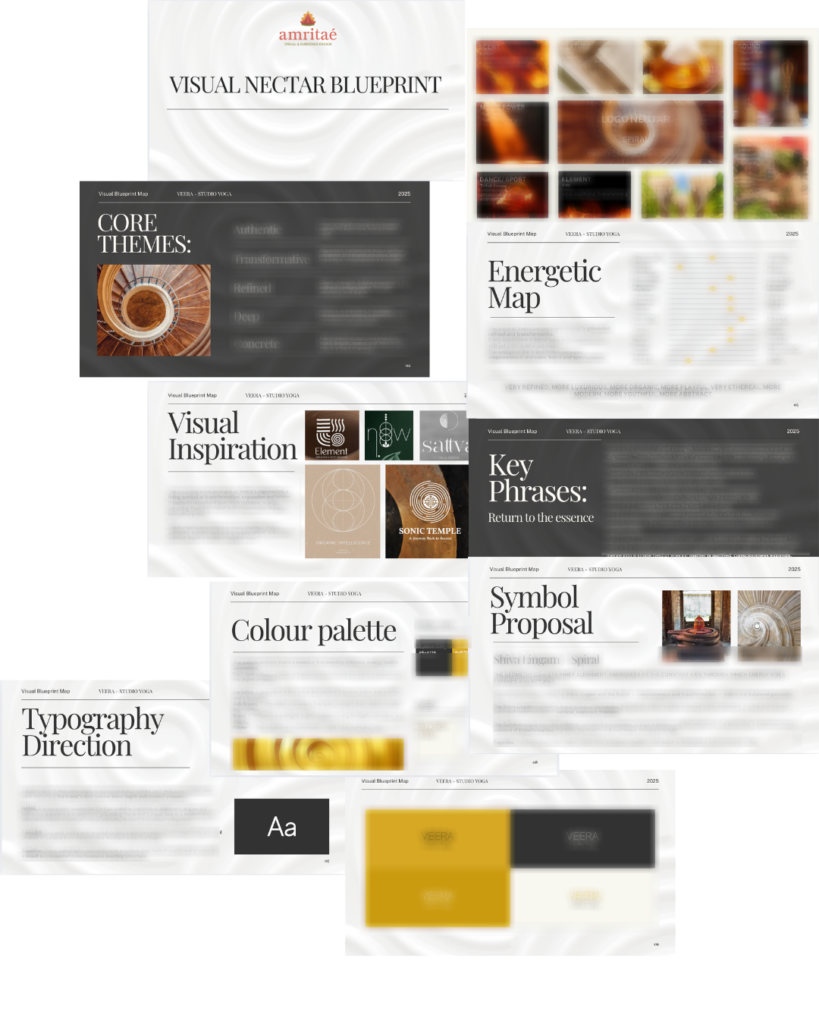
  • I create a visual blueprint that maps symbols, mood, typography and color into a structured system.

  • From there, I design the logo and core identity elements and test them in real contexts: website, social, print.

  • You receive a compact, usable identity kit you can actually work with: logo files, color codes, type system and key applications.

This is bespoke work, built to hold the depth of what you do and to be usable in real life, day after day.

Your brand can feel this aligned

Ready for your own logo design/complete visual identity?

If this project resonates and you want your own holistic logo design and visual identity made with the same depth, let’s build it together.

Yoli, founder of Amritaé Design, working at her desk with a laptop and digital pen in a softly lit studio space.

Founder

Yoli Amritae

I’m Yoli, a brand identity designer and brand mentor focused on visual alignment.

I have 14+ years of design experience, plus studies and background in communication, PR and NGO management. That mix brings structure, strategy and precision into my work, alongside depth, creativity and originality.

In recent years, my work expanded beyond execution. I now combine design with 1:1 guidance that clarifies direction first, so your brand can reflect its true essence in a clear visual form.

“Yoli has a rare ability to truly understand your brand and translate it into visual language that feels both authentic and impactful.”
Shared by a valued, long-term client.

I work with conscious entrepreneurs, creatives, and founders who want their presence to feel true on the outside and aligned on the inside.

Get in touch if you want a brand that’s unmistakably yours.

Scroll to Top